25 Peel and Stick Backsplash Ideas That Look Custom, Not Temporary
25 Peel and Stick Backsplash Ideas That Look Custom, Not Temporary
A peel and stick backsplash is the fastest way to change a kitchen without a contractor, a tile saw, or a landlord’s permission. The products have come a long way from the flat vinyl sheets of a few years ago: today’s peel and stick tiles come in thick PVC panels with real depth, glossy finishes that catch the light like ceramic, and printed patterns so convincing that guests lean in to check whether they are real. Most install in a single afternoon with nothing more than a level, a utility knife, and a clean wall — and most peel off cleanly when you move out or change your mind. The 25 ideas in this guide cover every look worth trying, from classic subway tile to faux marble slabs, bold patterns, textured materials, and color moves, plus the install and removal know-how that makes the difference between a backsplash that looks stuck-on and one that looks built-in.
1. Start With Glossy White Subway Tile
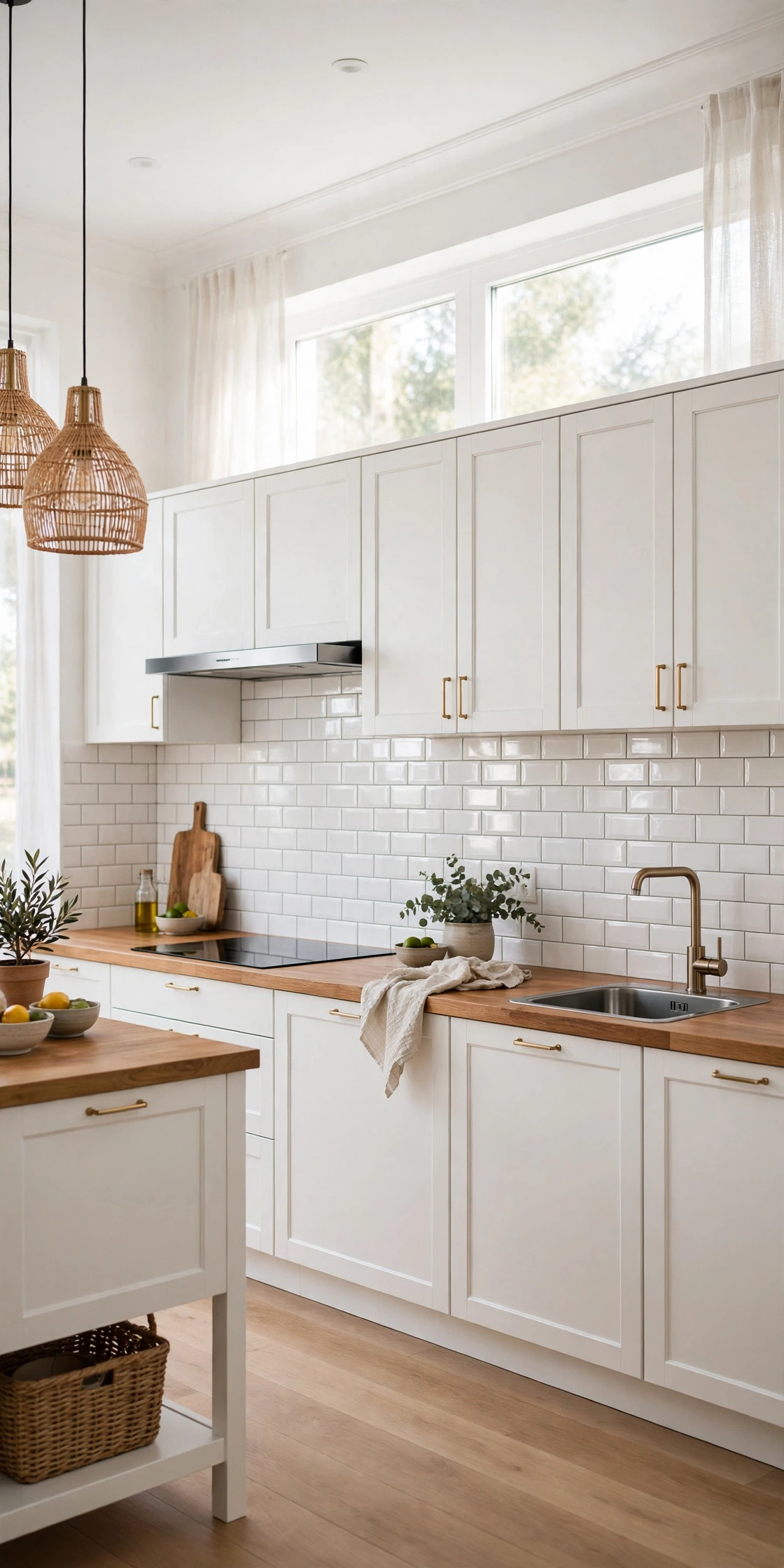
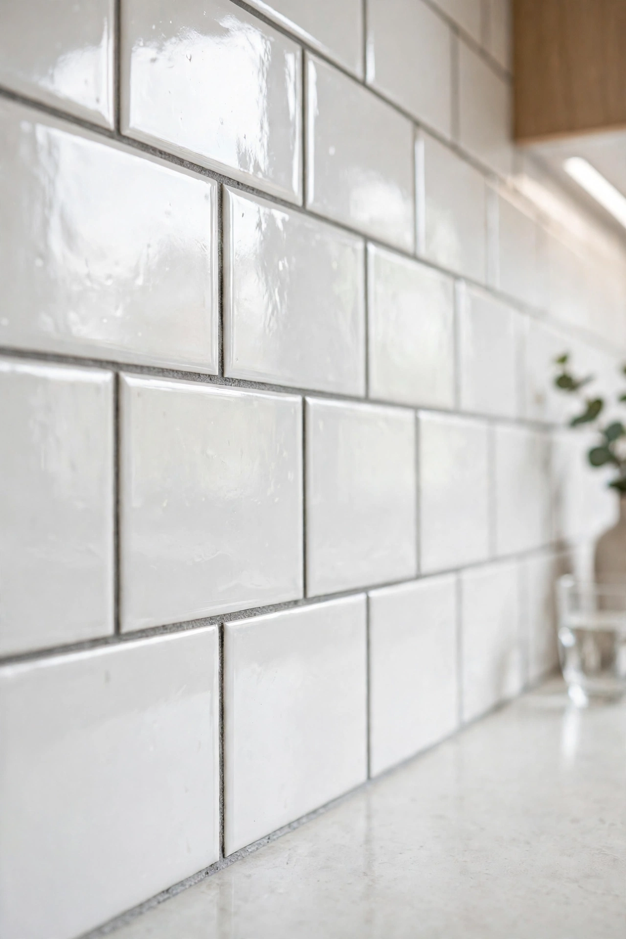
Glossy white subway tile is the classic peel and stick starting point, and it earns that place honestly. The shine bounces light around the kitchen, making even a dim rental feel brighter and bigger, and the familiar brick pattern suits almost any cabinet color, from white shaker to dark navy. Choose a version with a slightly raised, beveled edge rather than a flat print — the shadow line between tiles is what sells the look as real ceramic. Pick a slightly creamy white rather than stark bright white, which can flatten out under kitchen lighting. Install the first row perfectly level, because every row above it follows that line, and run the tiles from the counter to the bottom of the upper cabinets for a clean, intentional stopping point.
This is also the most forgiving first project for a peel and stick beginner. The pattern is regular, so cuts at the edges and around outlets are simple rectangles, and a single tile that goes up crooked can be peeled off and repositioned while the adhesive is still fresh. Pair the finished wall with black hardware and a wood cutting board or two, and the whole kitchen reads as renovated rather than decorated. It is the safest choice in this guide — and the one most likely to make your landlord ask who did the tiling.
2. Stretch the Classic With Elongated Subway Tile
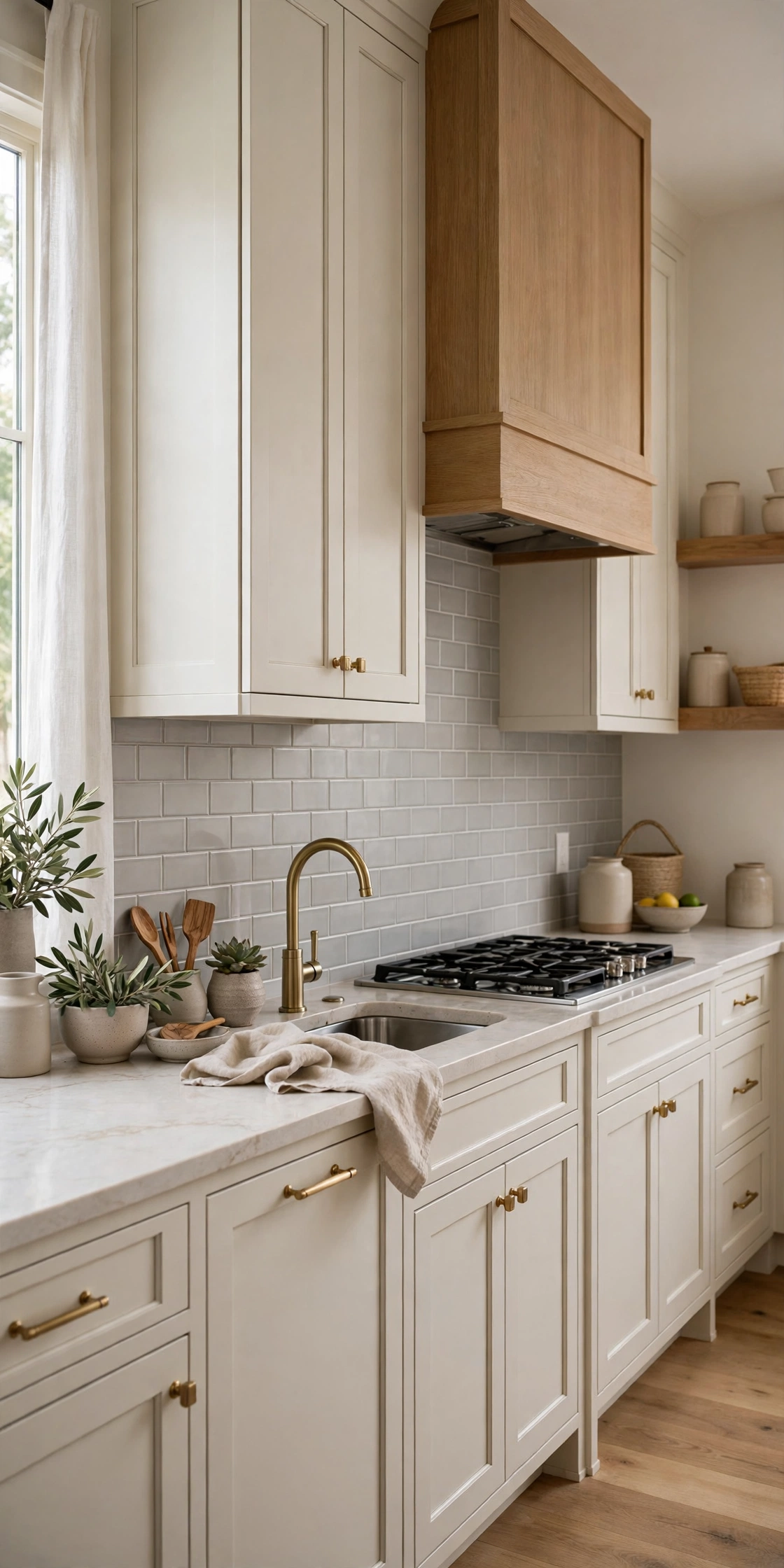
Elongated subway tile — the long, slim rectangle, usually two by eight or three by twelve inches — takes the same classic idea and gives it a more current, high-end feel. The longer format makes a small kitchen wall look wider, because the eye follows the horizontal lines across the room, and it suits modern and transitional kitchens better than the standard three-by-six brick. Peel and stick versions come in both individual tiles and printed sheets, and the sheet versions are faster to install on a long wall because you are aligning a few large pieces instead of dozens of small ones. Look for a soft gray or pale greige rather than pure white if your counters are warm-toned, so the wall and the worktop sit in the same color family.
The trick with elongated tile is keeping the grout lines — real or printed — perfectly straight, because a long tile shows a tilt that a short tile would hide. Draw a level pencil line at the counter, and use small spacers or the tile’s own printed grid to keep the rows even. Finish the top edge with a thin metal trim strip in brass or chrome, and the wall suddenly looks like a professional install. This is the look to choose when you want subway tile but want it to feel like a design decision rather than a default.
3. Stack Zellige-Style Tiles Vertically for a Handmade Feel
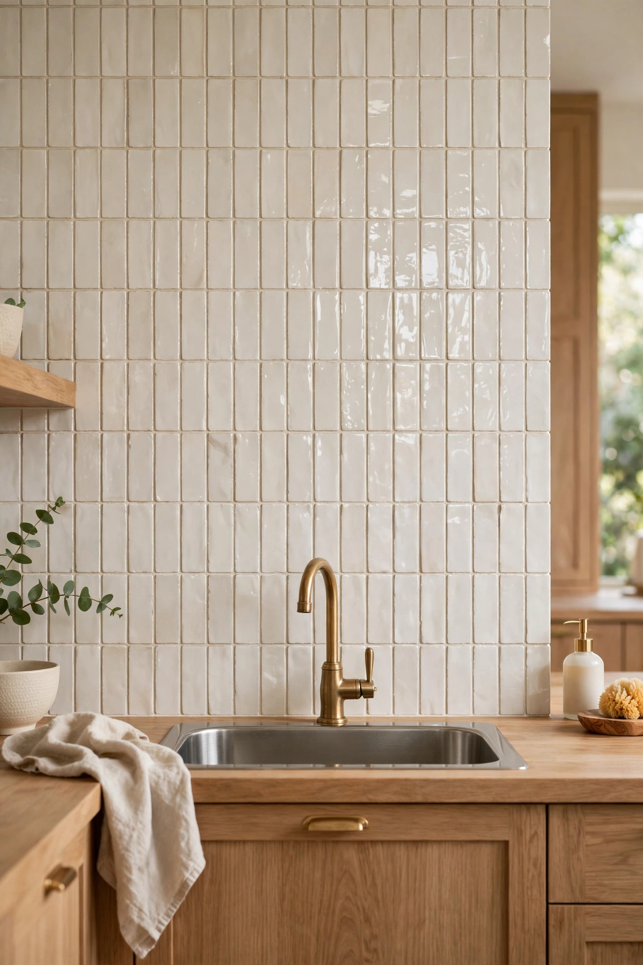
Zellige is the handmade Moroccan tile with a rippled, glossy glaze, and peel and stick versions copy that uneven surface surprisingly well. Stack the tiles vertically instead of in the usual running bond, and you get clean, continuous lines that make the wall between the counter and the cabinets feel taller — a genuine help in kitchens with low upper cabinets. The slightly irregular glaze is the whole point: it catches the light differently from tile to tile, so the wall has movement instead of the flat sameness of a printed sheet. Choose a creamy white or a pale sage glaze, and keep the surrounding palette quiet so the texture does the talking.
Prep matters more with zellige-style tiles than with any other look in this guide, because their charm depends on a flat wall. Wash the wall, let it dry completely, and sand down any bumps or drips of old paint before you start — a bump under a glossy tile shows as a bubble. Set the first column with a level, then work outward from the center of the wall so the cut tiles land symmetrically at both ends. Under-cabinet LED lighting is the finishing touch here: it rakes across the rippled surface and makes the whole wall glow in the evening.
4. Try Handmade-Look Square Tiles for a Soft, Collected Kitchen
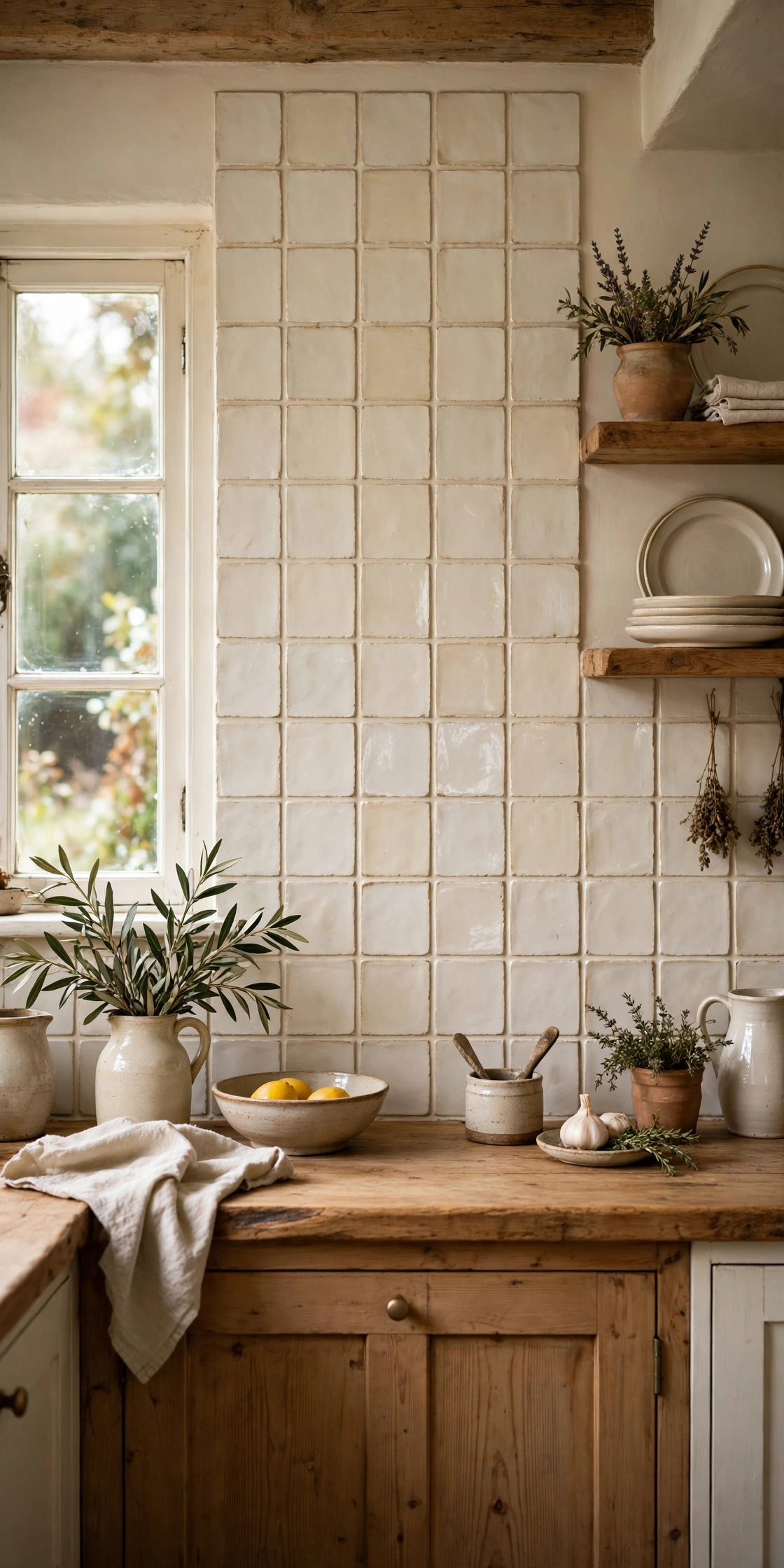
Square tiles with a handmade look — soft edges, a slightly uneven glaze, a warm cream or dusty white — give a kitchen the feel of a collected, lived-in space rather than a showroom. The square format suits cottage, farmhouse, and European-inspired kitchens, and it pairs beautifully with wood counters, open shelving, and vintage brass. Peel and stick versions of this tile usually come as individual thick PVC squares, which is good news: the thickness reads as real tile from a normal viewing distance, and the slight variation between pieces is exactly what makes handmade tile look handmade. Avoid the thinnest, flattest prints for this look — a square tile with no depth just reads as wallpaper.
Layout is simple but worth planning: a straight grid with even gaps looks deliberate, while a staggered brick pattern softens the squareness. Either way, mark the center of the wall and work outward so the cut pieces at the edges match on both sides. Keep the grout color close to the tile color — a soft gray on cream — so the grid reads as texture rather than as a checkerboard. Add a linen cafe curtain and a couple of ceramic canisters, and the wall feels like it has been there for decades rather than an afternoon.
5. Add Penny Round Tiles for Vintage Charm
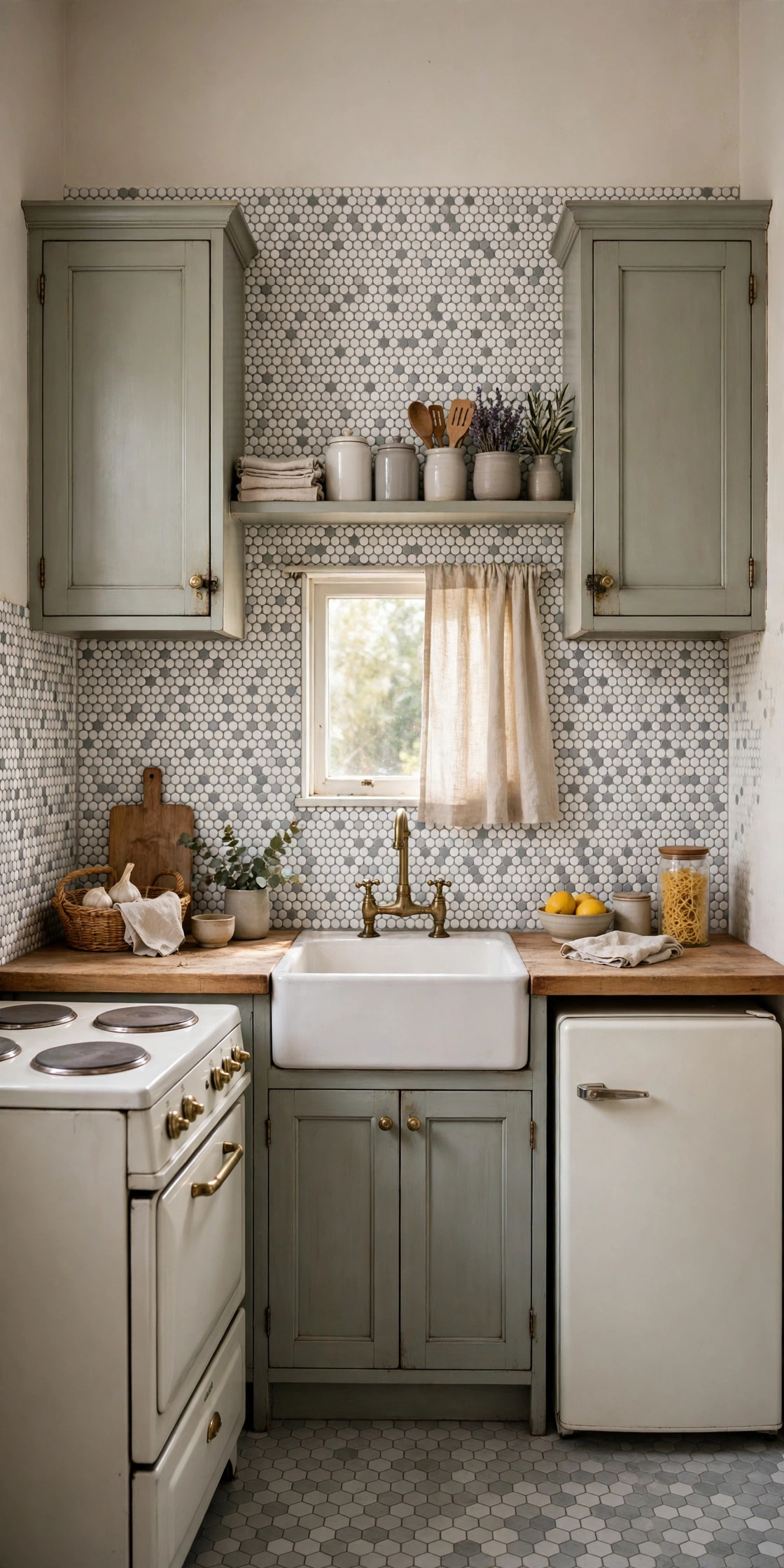
Penny round tiles — the small circles that have been in bathrooms and kitchens for a century — are one of the most charming peel and stick looks, and one of the most forgiving to install. The small scale hides imperfect cuts beautifully, because the eye reads the overall texture rather than any single tile, and the pattern suits small kitchens where a large tile would look out of proportion. White penny rounds with gray grout are the vintage classic, but the peel and stick versions also come in soft blue, sage, and mixed marble-look blends that feel more custom. Choose a sheet with a slightly raised, rounded surface rather than a flat print, because the three-dimensional dots are what catch the light.
The practical advantage of penny rounds is that they wrap neatly around outlets and corners: you trim the sheet to the curve instead of cutting a straight tile. Mark your outlet positions on the sheet before you peel the backing, and cut the openings with a sharp craft knife on a cutting mat for clean edges. A penny round backsplash pairs wonderfully with a farmhouse sink and a simple wood shelf, and it is one of the few patterns that looks equally at home in a kitchen and a bathroom. If you want a vintage feel without a vintage renovation, this is the fastest route.
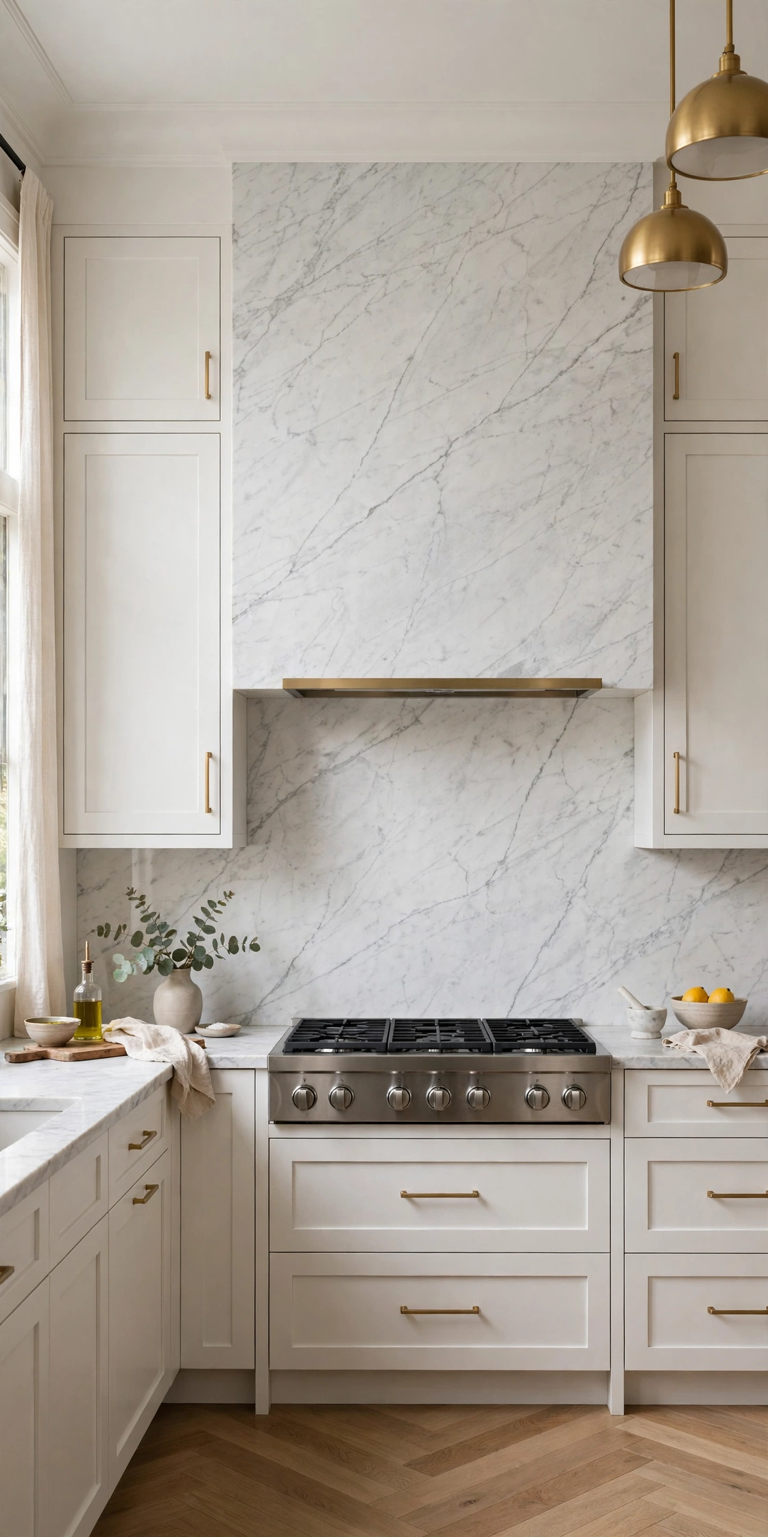
6. Fake a Marble Slab With No Grout Lines
A single seamless marble slab is one of the most expensive backsplashes you can buy — which is exactly why a faux version feels so high-end. Large-format peel and stick marble panels come in sheets big enough to cover the whole wall behind a range with one or two pieces, so there are no grout lines at all, just soft gray veining drifting across a white ground. The key to selling the illusion is thickness and finish: choose a thicker panel with a satin or soft semi-gloss surface, because a super-glossy vinyl looks like plastic under kitchen lights and a fully matte one looks like paper. Carrara is the safest pattern, with its fine gray veins, while Calacatta’s bolder gold veining suits kitchens that already have brass hardware.
Installation is all about alignment. Because the panel is large, a crooked start shows across the entire wall, so use a level and a second pair of hands to hold the sheet while you smooth it from the center outward with a plastic squeegee. Hide the seams by matching the vein pattern where two sheets meet, and run the panel from the counter all the way to the ceiling behind the range for a full-slab effect. Finish with a thin metal edge trim, and even a careful guest will need to touch the wall to know it is not stone.
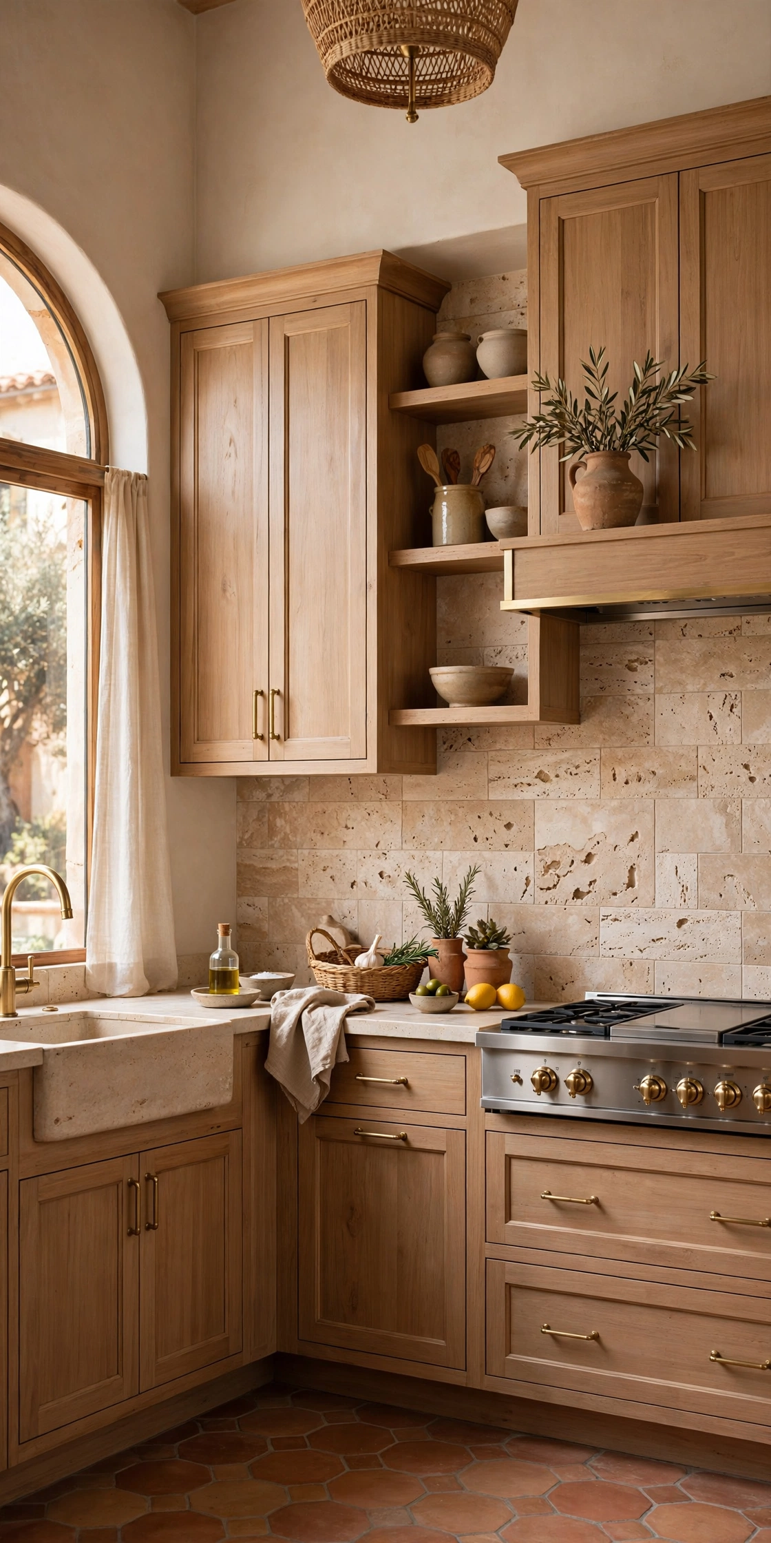
7. Warm the Kitchen With a Travertine Effect
Travertine brings a warm, old-world European feel that cool white tile cannot, and peel and stick versions capture its creamy beige tones and soft, cloudy movement surprisingly well. This is the look for a kitchen with warm wood cabinets, brass fixtures, or a Mediterranean leaning — the wall adds glow instead of contrast. Choose a panel with subtle tonal variation rather than a single flat beige, because real travertine is never one color, and a matte or low-sheen finish reads more like stone than a glossy one. The larger the panel, the better the effect: a big travertine-look sheet reads as a slab, while small printed squares read as a pattern.
Because the pattern is soft and low-contrast, installation mistakes are easier to hide than with a bold geometric print — a small misalignment disappears into the veining. That makes travertine a good choice for a first-time installer working alone. Pair it with open wood shelving, terracotta pots, and a linen towel, and the kitchen feels sun-warmed even on a gray day. If your kitchen runs cool and you want warmth without repainting the cabinets, this one change does most of the work.
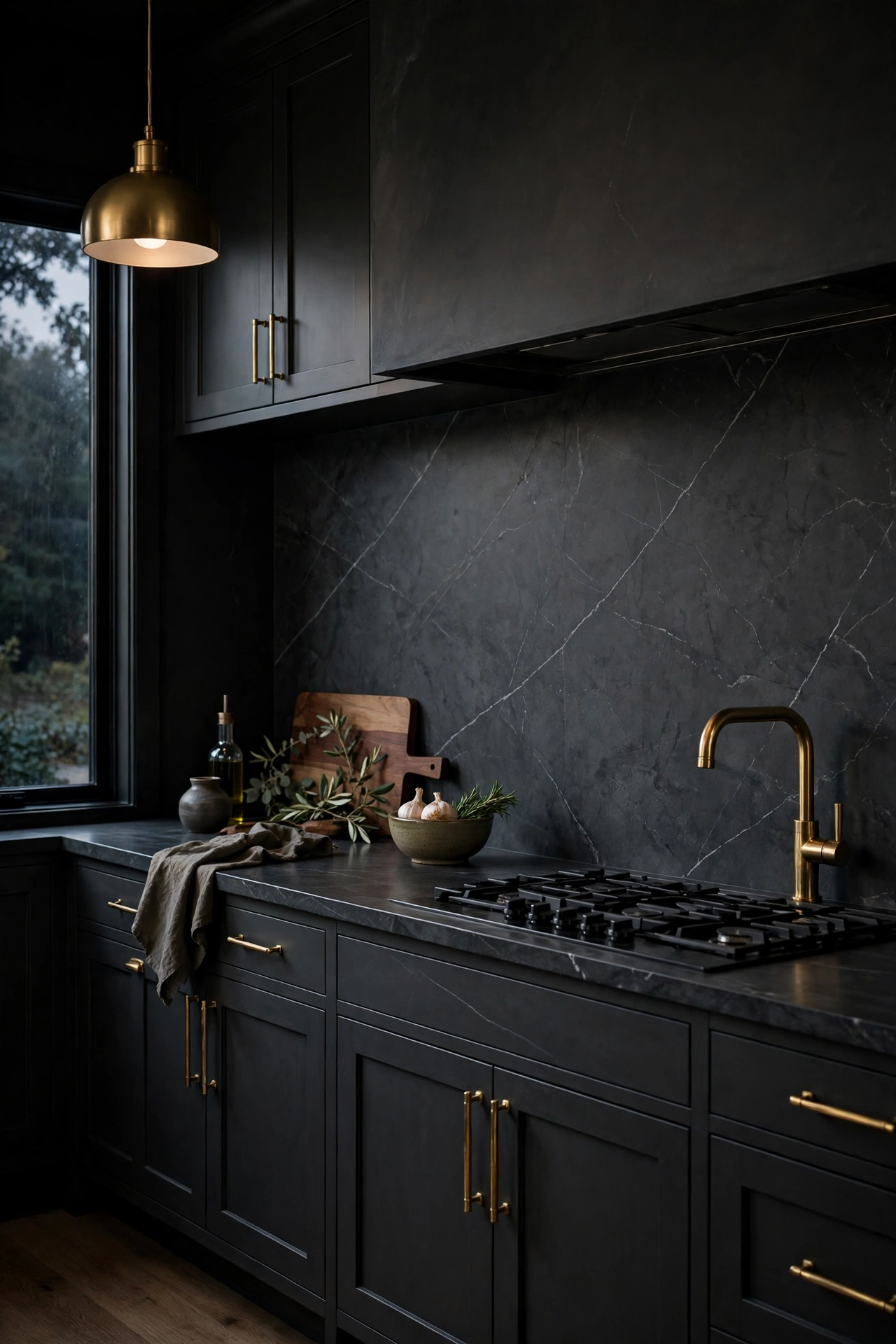
8. Go Dark With a Soapstone-Look Slab
A dark backsplash is a bold move, and a soapstone-look peel and stick panel makes it a reversible one. The deep charcoal surface with faint white veining grounds a bright white kitchen, adds drama behind a range, and makes brass hardware and light wood counters pop. Dark panels also hide cooking splashes better than white tile, which is a practical win behind a stove. The trick is balance: keep the rest of the kitchen light — white uppers, pale counters, plenty of light — so the dark wall reads as an anchor rather than a cave. A satin finish works best here, because a high gloss on a dark surface shows every fingerprint.
Install a dark panel with extra care around the edges, because a dark sheet against a light wall makes a crooked cut obvious. Use a metal straightedge and a fresh blade for every cut, and finish the top edge with a slim brass or black trim strip. Under-cabinet lighting is almost essential with a dark backsplash: warm light grazing the surface shows off the veining and keeps the wall from going flat. This is the idea for anyone who loves the look of a dark, moody kitchen but is not ready to commit to real stone.
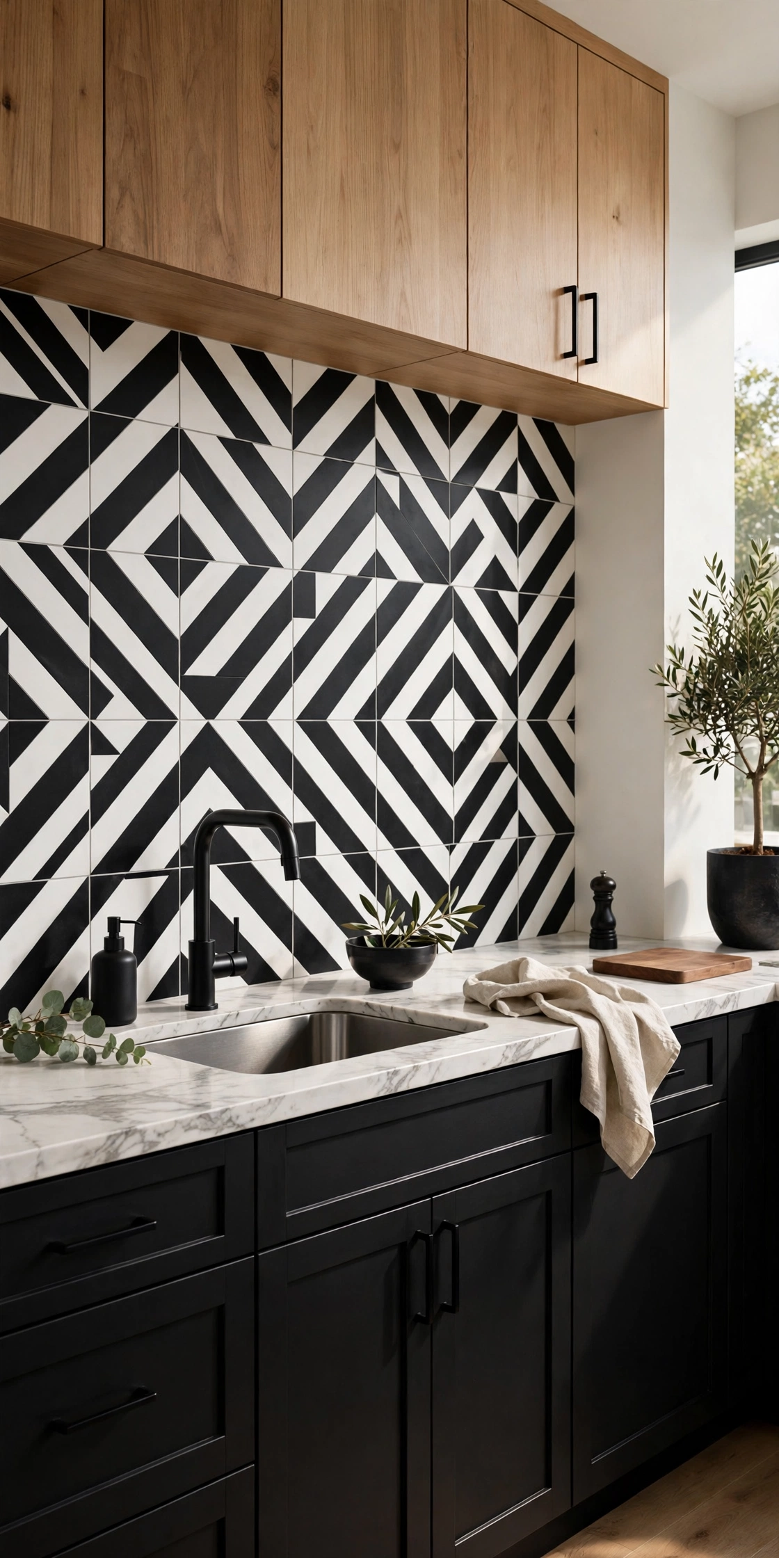
9. Make a Statement With Bold Geometric Patterns
Bold geometric peel and stick tile is the fastest way to give a plain kitchen a personality. Black-and-white triangles, oversized diamonds, or a sharp chevron in two tones turn a blank wall into the room’s focal point, and the pattern does the decorating so the rest of the kitchen can stay simple. The rule with a strong pattern is restraint everywhere else: plain counters, solid-color cabinets, and minimal open shelving let the wall carry the room. Choose a pattern with a scale that suits the wall — a big, confident motif on a long run, a smaller one in a galley kitchen where a huge pattern would feel crowded.
Pattern matching is the skill that matters here. Before you peel anything, dry-lay two sheets side by side and check that the motif lines up across the seam; a pattern that jumps at the joint ruins the effect. Most good peel and stick geometrics are printed with a repeat that aligns if you butt the sheets edge to edge, but a quick test saves a ruined sheet. Start at the most visible point — usually the center of the wall behind the range — and work outward so any pattern compromise lands at the edges where it is least noticed.
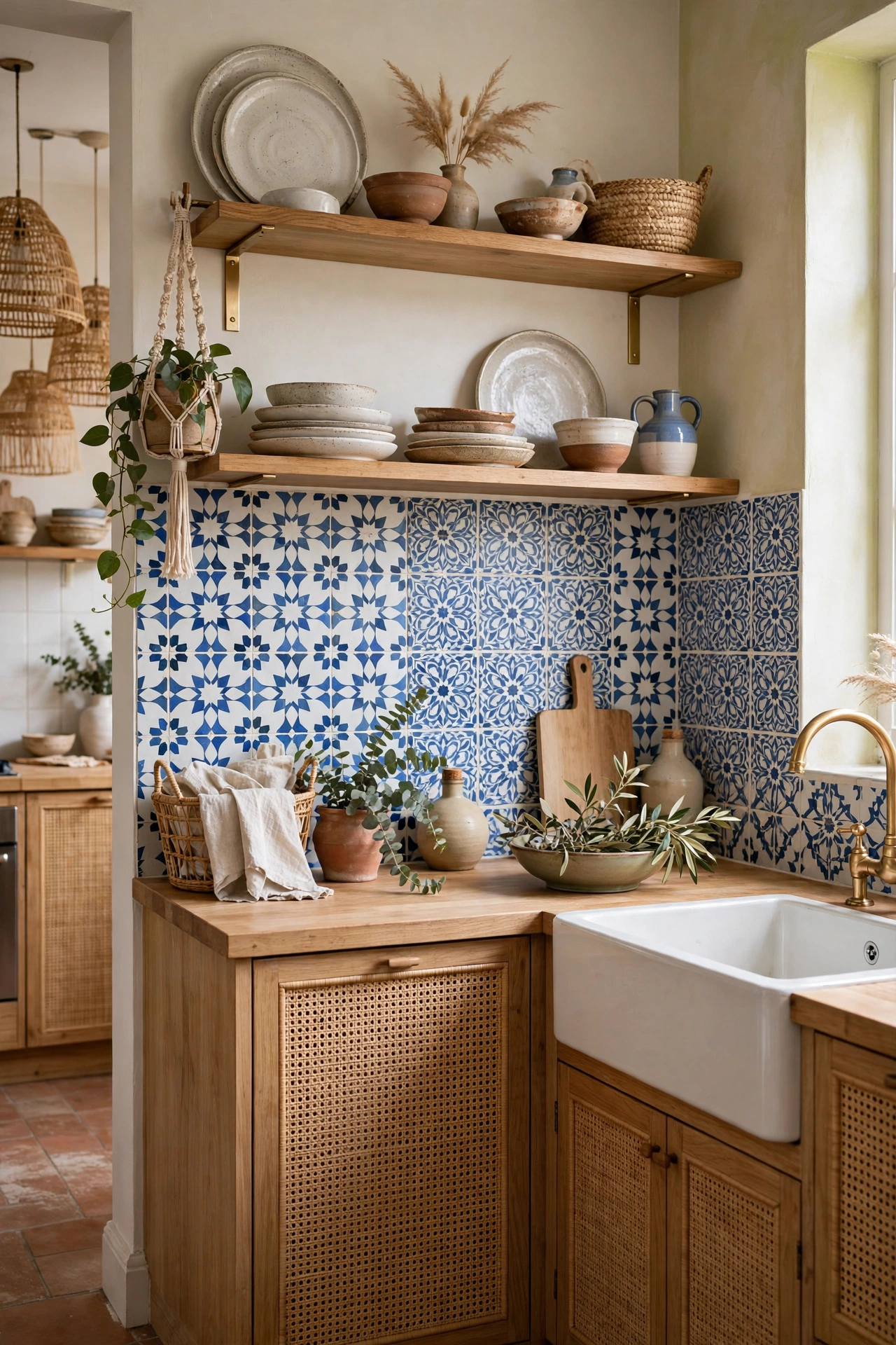
10. Borrow a Moroccan Cement-Tile Print
Patterned cement tile used to mean a contractor, a wet saw, and a big budget. Now vinyl peel and stick squares copy those printed designs closely, and the matte versions read a lot like real concrete tile. A Moroccan or encaustic-style print in blue and white, or in soft terracotta and cream, brings instant character to a neutral kitchen and suits boho, eclectic, and Mediterranean styles. The trick is choosing a print with enough color variation to look hand-painted, and keeping the rest of the kitchen calm — plain counters, simple hardware, and one or two pattern-free zones — so the wall feels curated rather than busy.
Because these tiles come as individual squares, you can mix and match: use one pattern for the whole wall, or alternate two complementary patterns in a checkerboard for a more collected look. Either way, lay the tiles out on the counter first and photograph the arrangement before you stick anything, because a pattern that looks good in the box can feel chaotic on the wall. A cement-tile print is also one of the best patterns for hiding an imperfect wall, since the busy design distracts the eye from small bumps underneath.
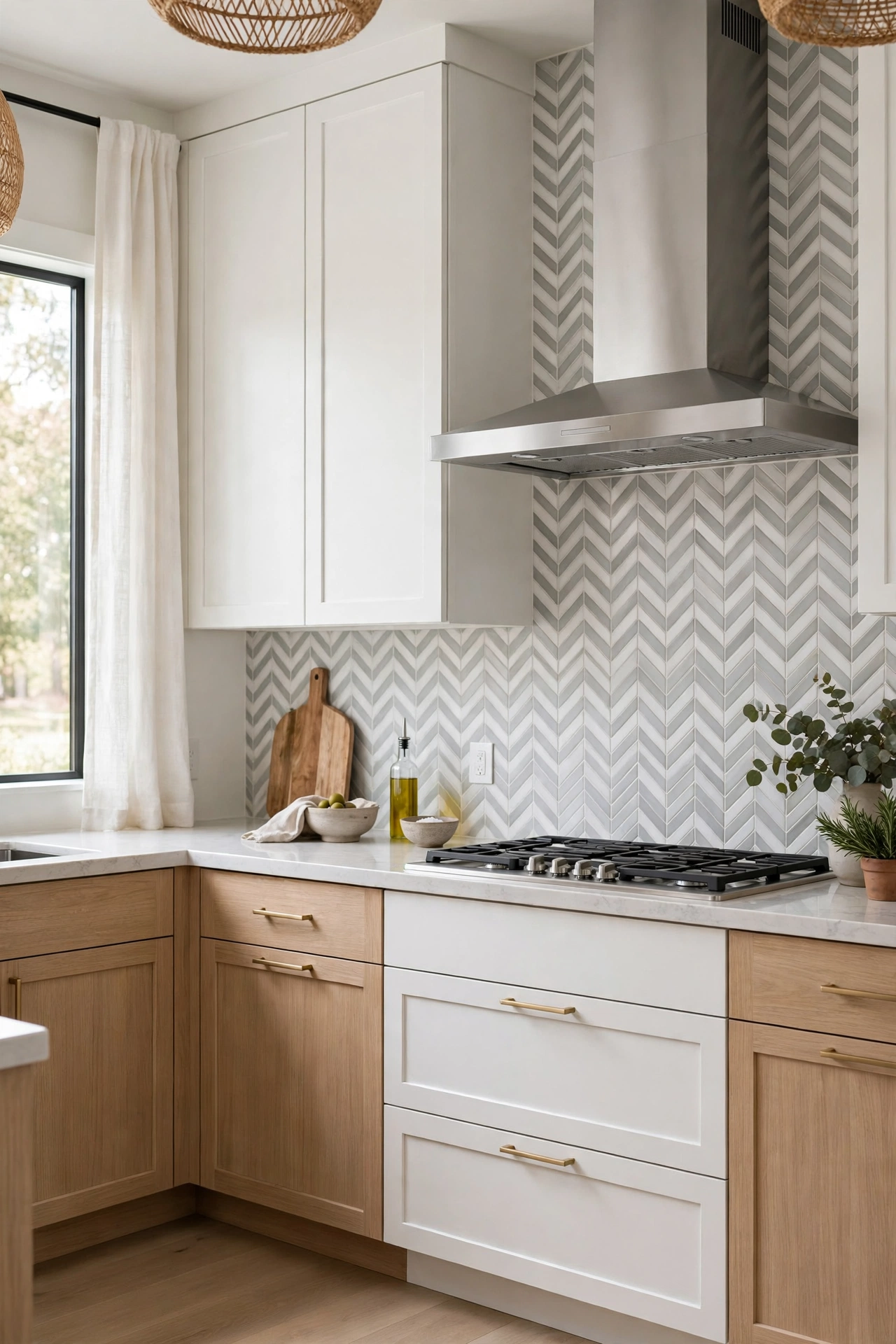
11. Lay a Chevron or Herringbone Pattern
Chevron and herringbone are the patterns that make a small kitchen feel designed rather than decorated. The angled lines draw the eye across the wall, add movement to a room that is mostly straight lines, and suit everything from modern farmhouse to classic transitional kitchens. Peel and stick versions come in both marble-look and solid-color chevrons, and the marble-look ones are particularly convincing because the veining breaks up the geometry. A soft gray-and-white chevron is the safest choice; a navy or forest-green version is the bolder one, and it works beautifully as a single accent wall behind the range.
The install needs patience, because every piece has to meet its neighbor at a perfect point. Use a level line at the counter and a second line at the center of the wall, and work from the center outward so the pattern stays symmetrical. A herringbone made from individual peel and stick rectangles takes longer than a printed sheet, but the result has real depth and shadow that a flat print cannot match. If you are short on time, choose a printed chevron sheet instead — it gives you ninety percent of the look in a third of the time.
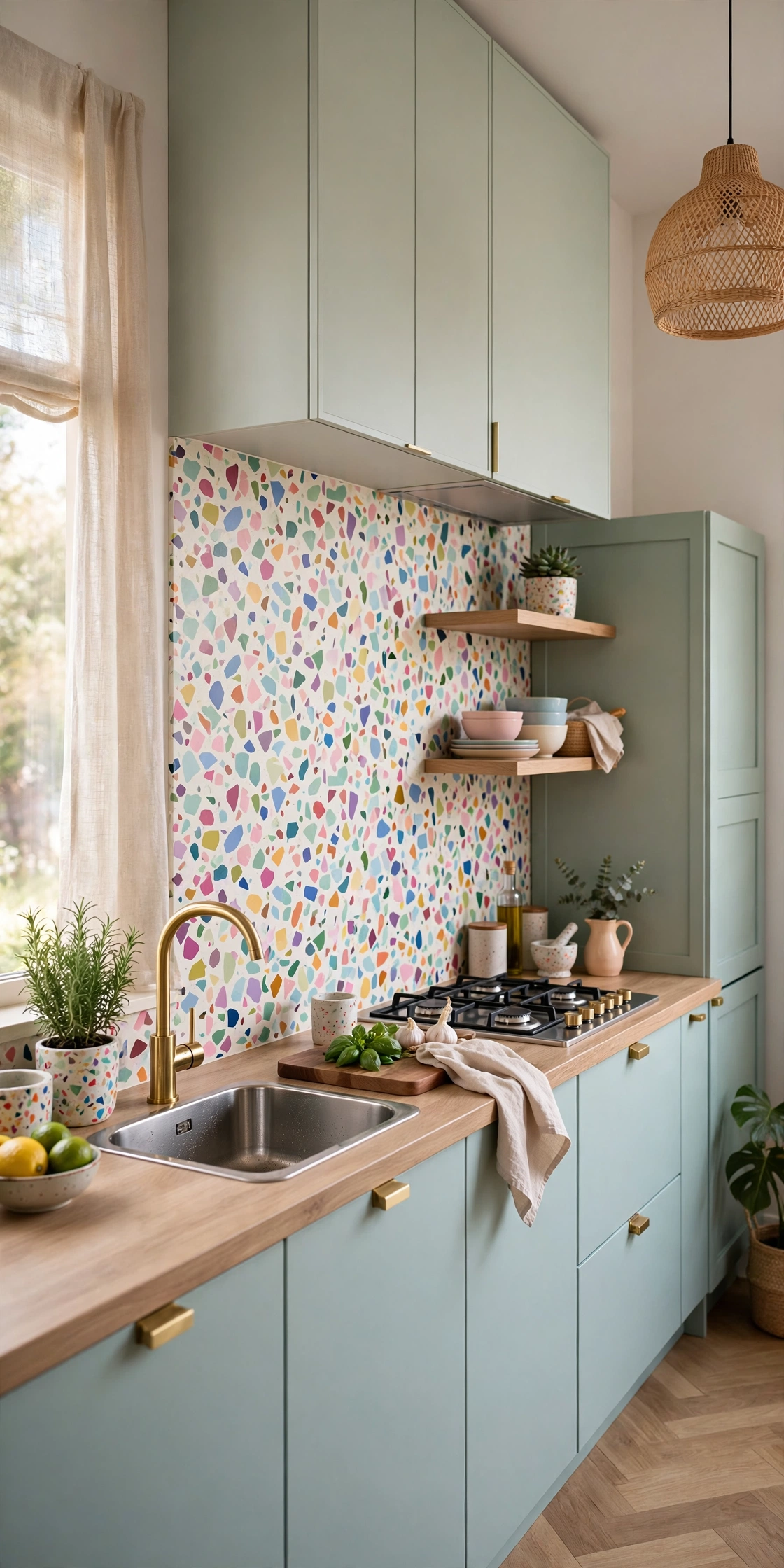
12. Hide the Mess With Terrazzo-Style Speckles
Terrazzo-style peel and stick is the most practical pattern in this guide, and the most playful. The confetti of colored chips — soft pink, sage, mustard, gray — hides grease splatters, water spots, and fingerprints better than any solid color, which makes it a genuinely smart choice behind a busy stove. It also brings a cheerful, mid-century energy to a kitchen that might otherwise feel plain, and it pairs well with light wood, white cabinets, and simple black hardware. Choose a terrazzo with chips in three or four colors rather than a single tone, because the multi-color version reads as real terrazzo while the single-color version reads as a print.
Installation is forgiving, because the random speckle pattern has no lines to align and no motif to match across seams — a small gap or a slightly crooked edge disappears into the confetti. That makes terrazzo a great first peel and stick project for anyone nervous about precision. Keep the counters clear and the accessories minimal, because the wall is already doing a lot of visual work. If your kitchen is the kind where cooking actually happens every day, this is the pattern that will still look good at the end of a busy week.
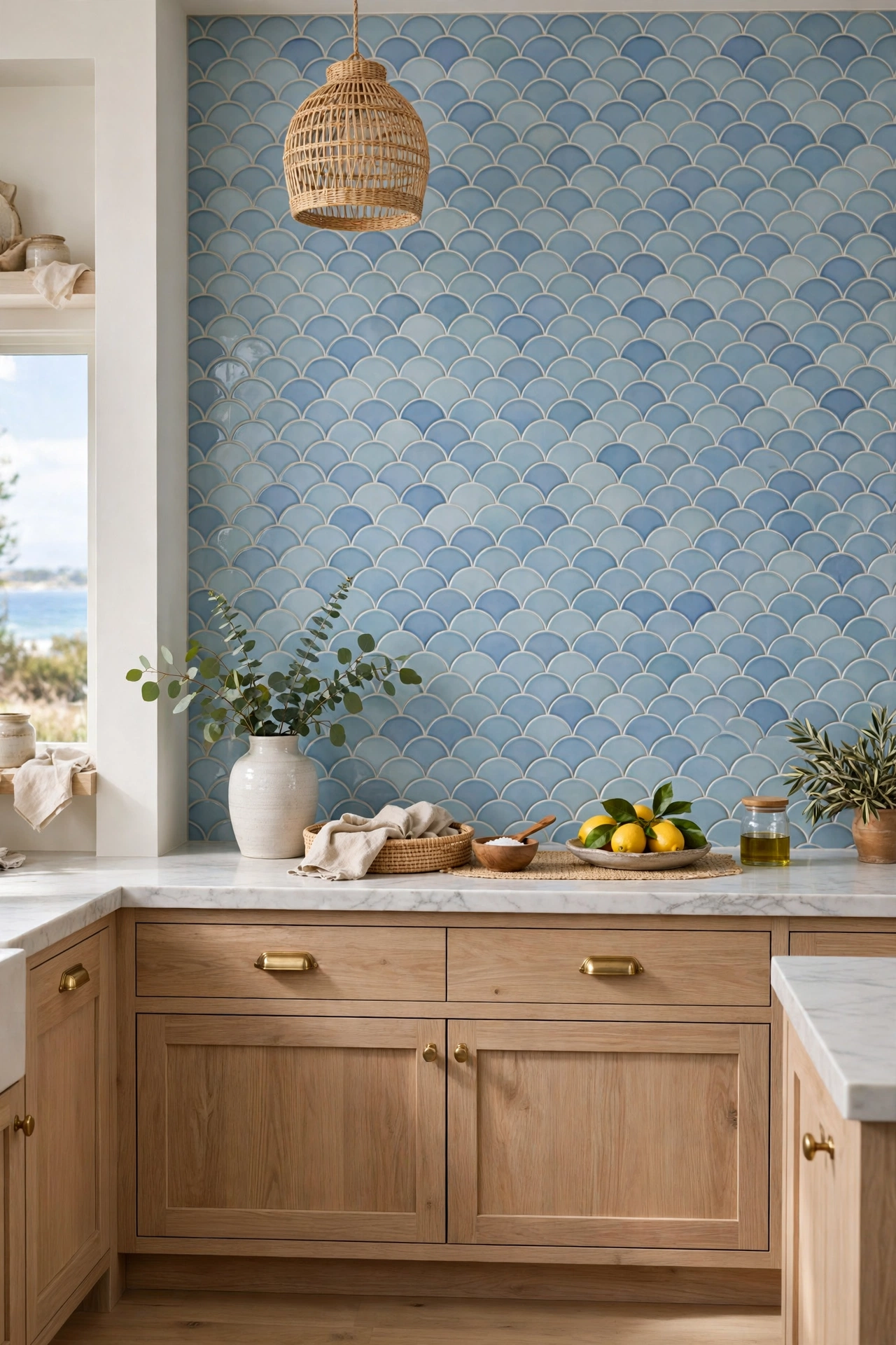
13. Bring the Coast In With Fish Scale Tiles
Fish scale — or scallop — tiles are the prettiest peel and stick pattern for a coastal or cottage kitchen, and the shape alone does most of the decorating. The overlapping curves catch the light like the surface of water, and a soft blue, seafoam, or pale aqua glaze makes the whole kitchen feel breezy. Peel and stick fish scale tiles usually come as sheets of interlocking scallops, which makes installation faster than individual tiles, and the curved edges are forgiving around outlets and corners. The key is scale: choose scallops big enough to read as a pattern from across the room, because tiny scallops printed on a sheet can look toy-like.
Pair a fish scale backsplash with white cabinets, light wood, and simple brass or nickel hardware, and keep the counters pale so the blue stays the star. A white or very pale gray grout color keeps the scallops crisp, while a matching blue grout makes the wall feel like one continuous wave. This is also a lovely choice for a bathroom vanity backsplash, where the watery pattern feels right at home. If your kitchen faces the garden or the sea, a fish scale wall is the closest thing to bringing the view inside.
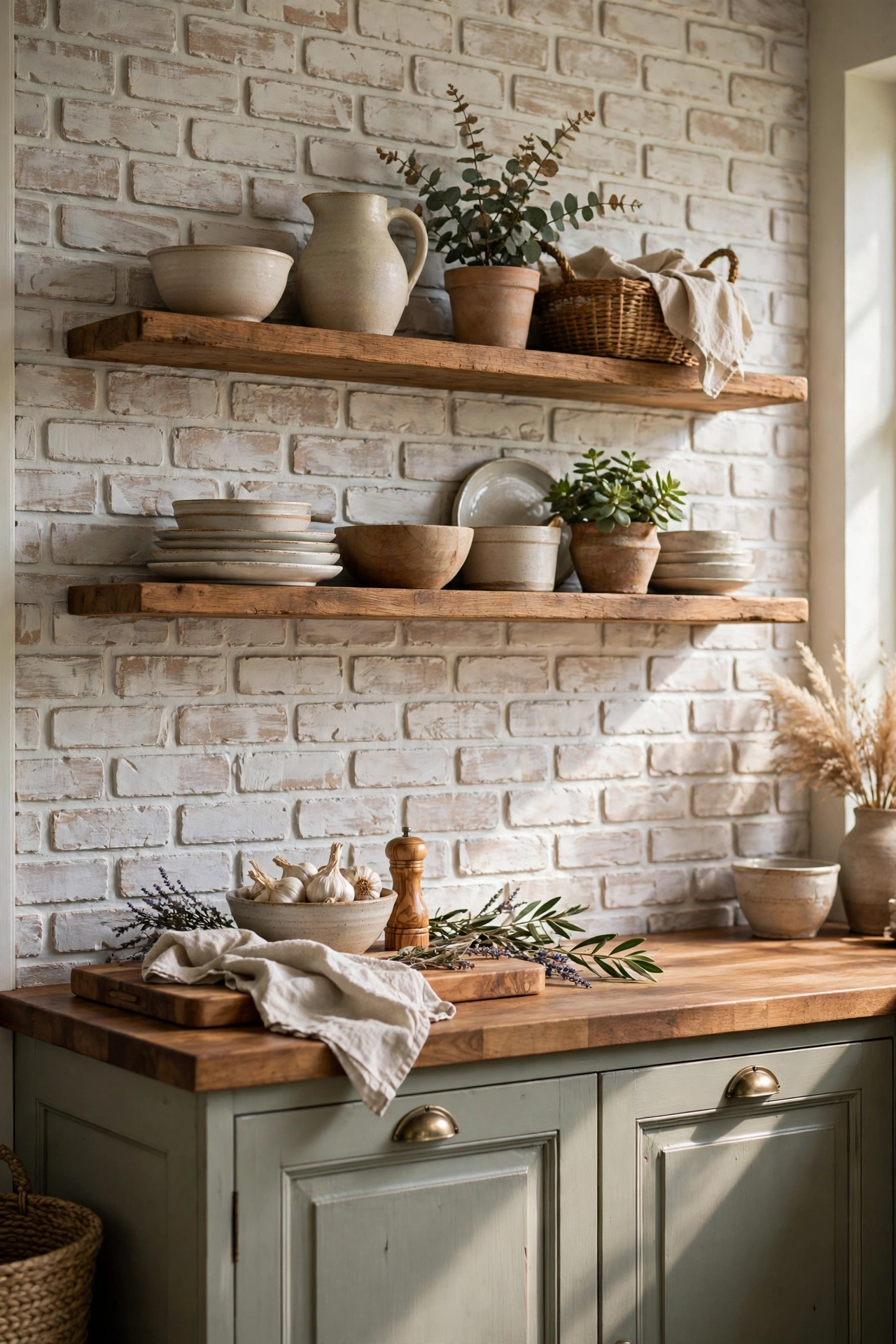
14. Whitewash a Faux Brick Wall for Farmhouse Warmth
Faux brick is one of the easiest looks to fake well, because a whitewashed finish hides the fact that it is printed. Textured faux brick panels or peel and stick brick wallpaper give a kitchen the warm, rustic character of a century-old farmhouse without the weight, the dust, or the masonry bill. The whitewash is important: heavily printed red brick can look flat up close, while a light, washed-out brick reads as limewash and feels softer. This look belongs in a farmhouse or rustic kitchen, ideally behind the range or across the whole wall, paired with wood shelves, black hardware, and a deep farmhouse sink.
The main caution with brick is texture. Peel and stick loves a smooth wall, and a heavily textured brick panel needs a flat surface to grip — press each panel firmly with a roller or a clean cloth, working from the center outward to push out air. If your wall has heavy orange-peel texture, skim it smooth first or choose a thinner brick wallpaper that conforms better. Our farmhouse kitchen backsplash ideas show the permanent versions of this look — real brick veneer, shiplap, and beadboard — if you ever want to make the style permanent. Until then, the peel and stick version gets you the same warmth in an afternoon.
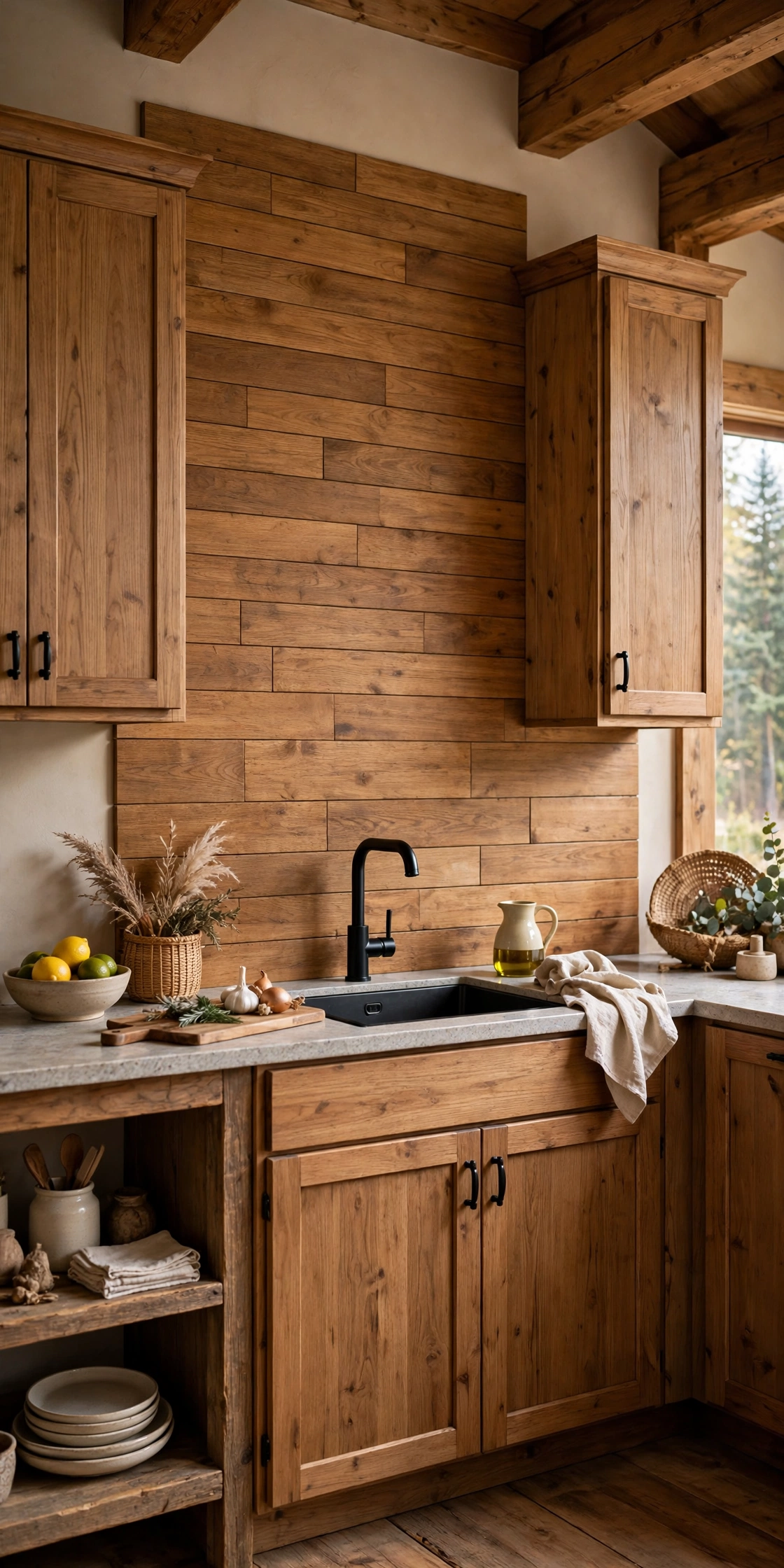
15. Warm the Wall With Faux Wood Planks
Faux wood plank peel and stick panels bring a warm, cabin-like feel to a kitchen that needs softening, and they are one of the most convincing fakes in the category because wood grain is naturally irregular. The best versions use a slightly raised, textured surface and vary the tone from plank to plank, so the wall reads as reclaimed timber rather than a photograph of it. Warm oak and weathered gray are the most versatile tones; a dark walnut suits a moody kitchen, while a pale whitewash fits a Scandinavian one. Run the planks horizontally for a shiplap feel, or vertically to make a low ceiling feel taller.
Keep the wall dry in mind: wood-look vinyl is fine behind a sink with a good seal, but avoid the area directly behind a gas range, where heat can soften the adhesive. Seal the top edge with a thin bead of clear silicone where the panel meets the upper cabinets, so steam and splashes cannot creep behind it. Pair the wood wall with white cabinets and black hardware for contrast, or with sage green cabinets for a soft, nature-inspired kitchen. If your kitchen feels cold and you want warmth without new cabinets, a wood plank backsplash is the quickest change you can make.
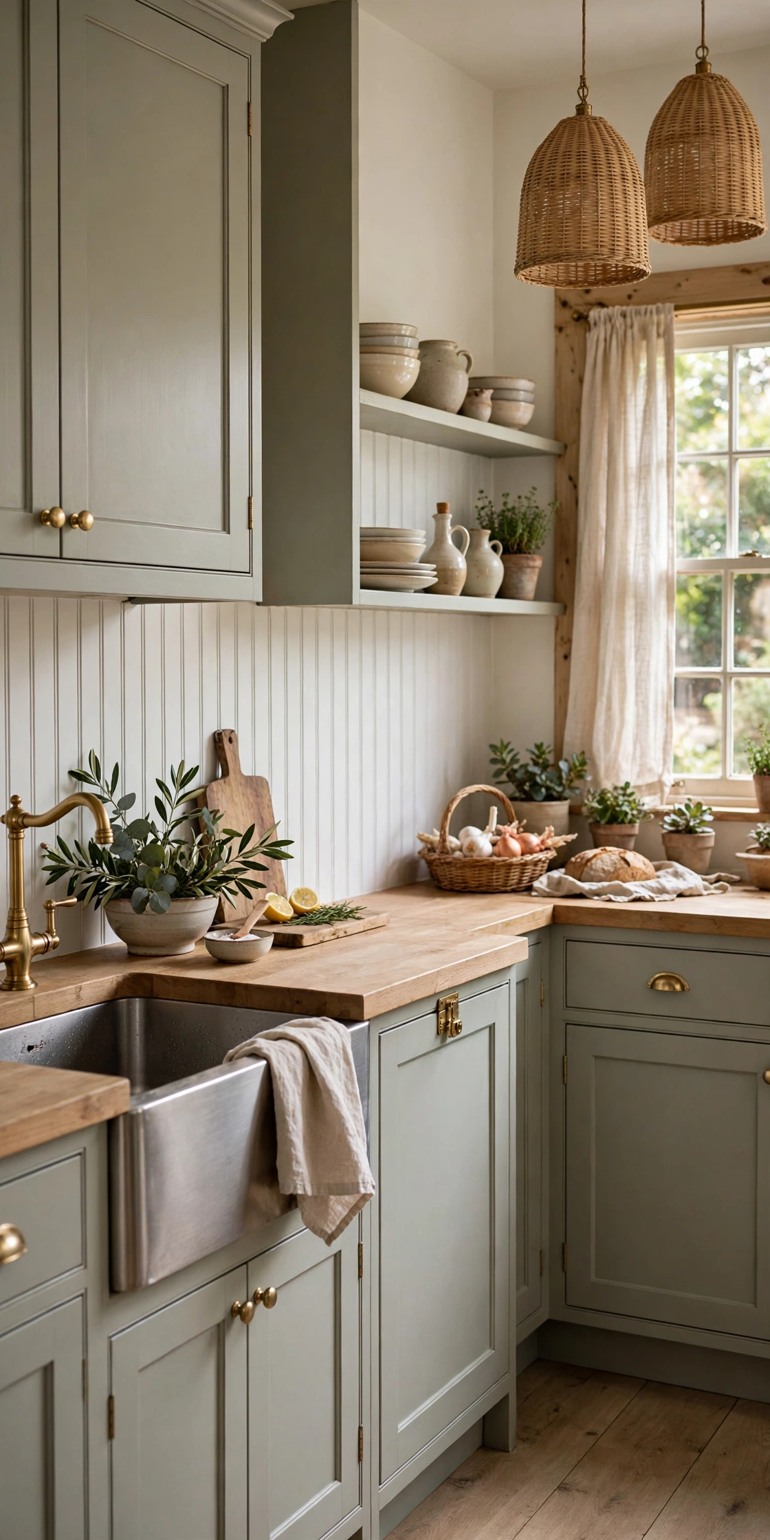
16. Line the Wall With Beadboard for a Cottage Feel
Beadboard is one of those backsplash looks that feels old in the best way — soft, painted, and quietly charming. Thin beadboard panels or peel and stick beadboard sheets install quickly, paint beautifully, and suit cottage, coastal, and farmhouse kitchens. The vertical grooves add texture without pattern, which makes beadboard the right choice when the kitchen already has a lot going on — patterned curtains, open shelves, colorful dishes — and the wall needs to calm things down rather than add more. Paint it in a washable semi-gloss white for the classic look, or a soft sage or pale blue for a little more personality.
Installation is straightforward: the panels are light, so they go up with their own adhesive, and the grooves hide small seams between panels. The detail that sells it is the finish at the top — a simple chair rail or a thin trim strip where the beadboard meets the cabinets makes it look built-in rather than stuck on. Because beadboard is painted, you can repaint it whenever the kitchen changes color, which makes it the most flexible backsplash in this guide. It is the quiet classic: never the loudest wall in the room, and often the one people love most.
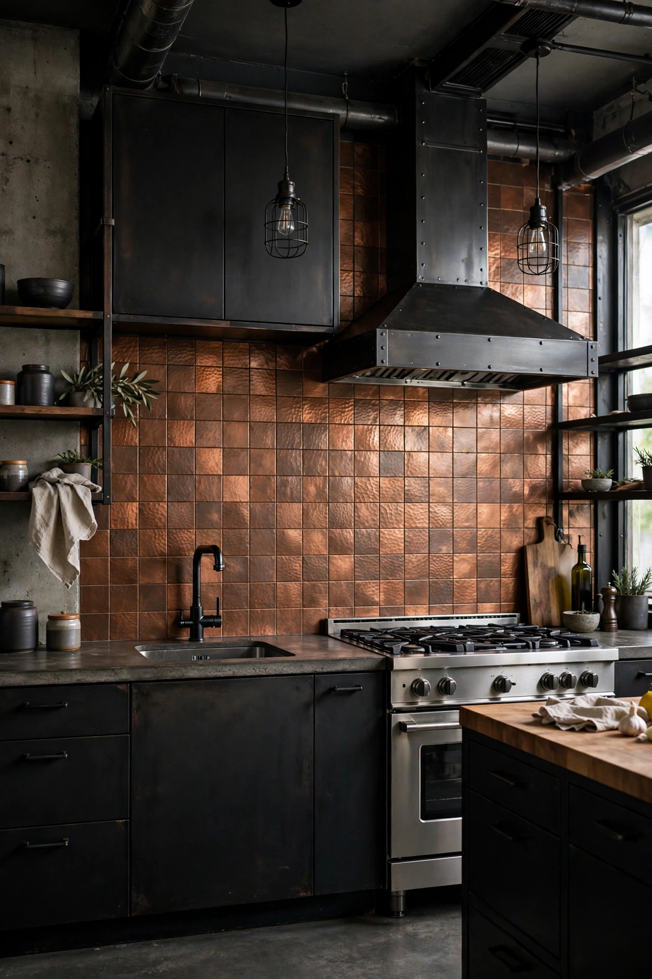
17. Add Warmth With Hammered Metal or Faux Tin
Peel and stick metal tiles bring a vintage, industrial charm that no printed vinyl can quite match, because the metal itself has depth. Hammered copper sheets warm up a galley kitchen, faux tin panels with embossed patterns recall old-fashioned ceilings, and brushed aluminum suits a sleek modern space. The trick is to keep the metal to a defined zone — from the counter to the upper cabinets, and no further — and to finish the edges with a simple trim, so the wall reads as an intentional accent rather than a leftover. Copper and brass tones are the warmest choice; stainless and aluminum are cooler and more modern.
Metal tiles are heavier than vinyl, so wall prep matters: the surface must be clean, dry, and smooth, and pressing each tile firmly with a roller helps the adhesive bond. Keep metal away from the hottest part of the range if the product is not rated for heat, and wipe it with a soft cloth rather than an abrasive pad, because the finish scratches. Paired with dark cabinets or a black range, a metal backsplash becomes the warm, glowing center of the kitchen. It is the look for anyone who loves vintage character but rents the walls it lives on.
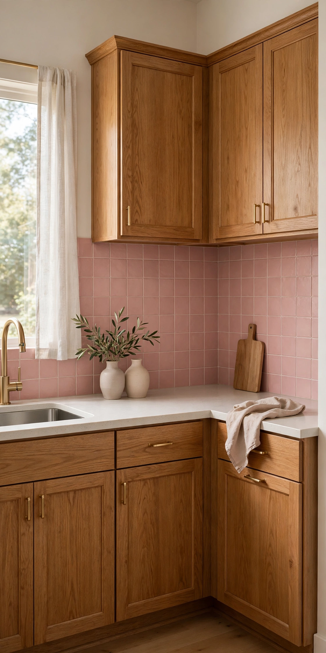
18. Warm Up Dated Cabinets With Dusty Pink Square Tile
Dusty pink is the color that rescues dated oak cabinets. Where a white backsplash can make honey-oak cabinets look more orange, a soft, muted pink warms them up and makes the whole kitchen feel intentional. Square peel and stick tiles in a dusty rose or pale blush, laid in a straight grid, give the wall a gentle, vintage softness that suits a cozy kitchen. Keep the pink muted — a dusty, grayed pink, not a bubblegum one — and pair it with cream counters, brass hardware, and a wood cutting board or two. The result feels warm and collected rather than themed.
The practical advantage of a colored square tile is that it is easy to install: the grid is regular, the cuts are straight, and a single tile can be replaced without redoing the wall. Use a grout color close to the tile — a soft warm gray — so the grid stays subtle. This is also a good choice for a small kitchen, because a soft color on the wall makes the room feel larger than a bold pattern would. If your cabinets are the one thing you cannot change, changing the wall behind them is the next best thing, and dusty pink is the color that does it best.
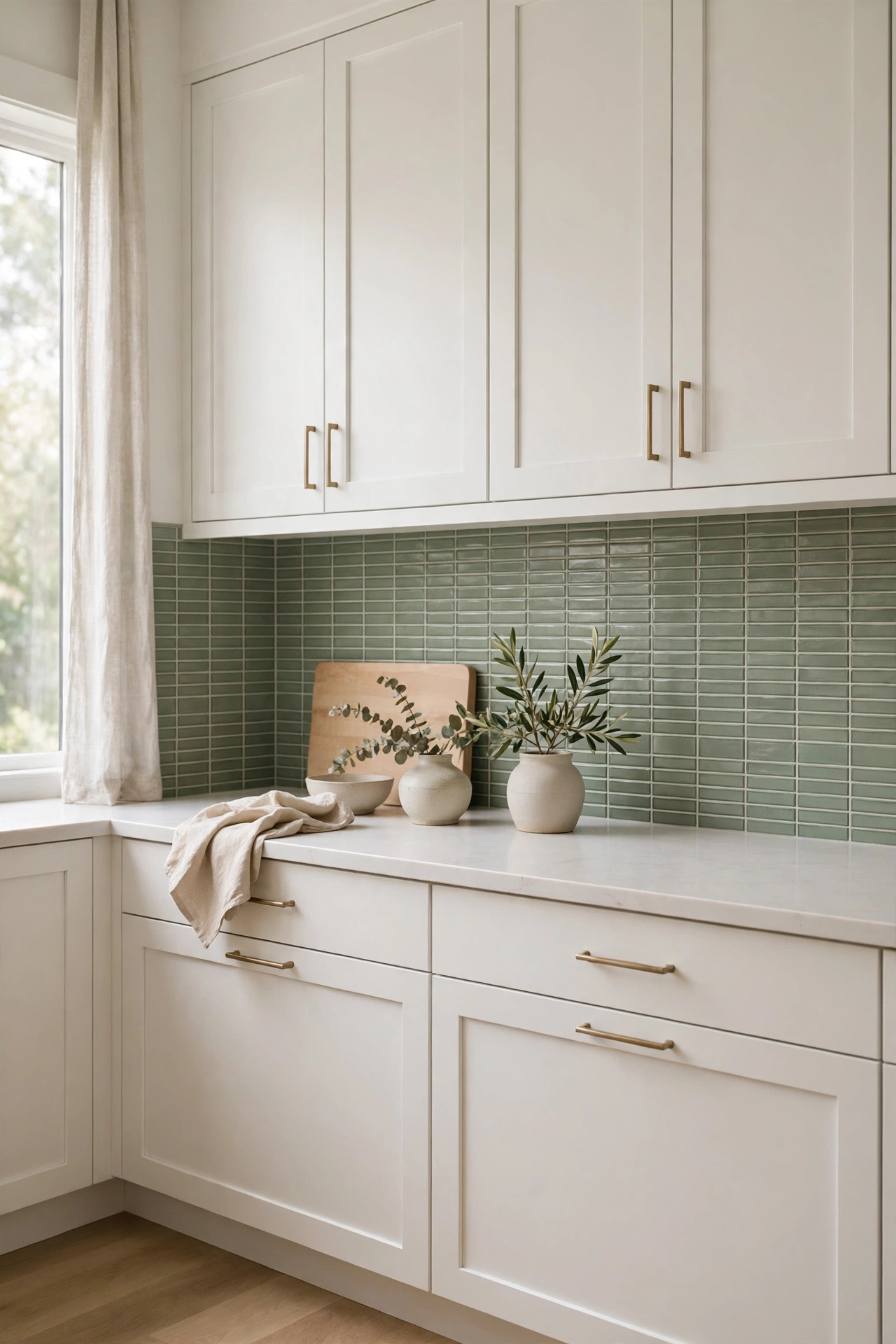
19. Calm the Kitchen With Sage Green Tile
Sage green is the color of the moment for a reason: it is calm, earthy, and it makes a kitchen feel like a garden room. Stacked peel and stick tiles in a soft sage, laid vertically, give the wall a quiet, botanical feel that works with white cabinets, light wood, and black or brass hardware alike. The vertical stack elongates the wall, which helps in kitchens where the gap between counter and cabinets is short. Choose a glaze with a little variation — a handmade-look sage with soft tonal shifts — rather than a flat, single-color print, because the variation is what keeps the wall from looking painted.
Sage is also one of the easiest colors to live with long term: it does not date as fast as a bold trend color, and it pairs with almost any accent — terracotta pots, linen towels, copper pans, or a bowl of lemons on the counter. If you want the wall to feel like a design decision rather than a safe choice, add a single row of a contrasting tile — a cream or a soft gold — as a border along the top. That one detail turns a simple green wall into a finished one.
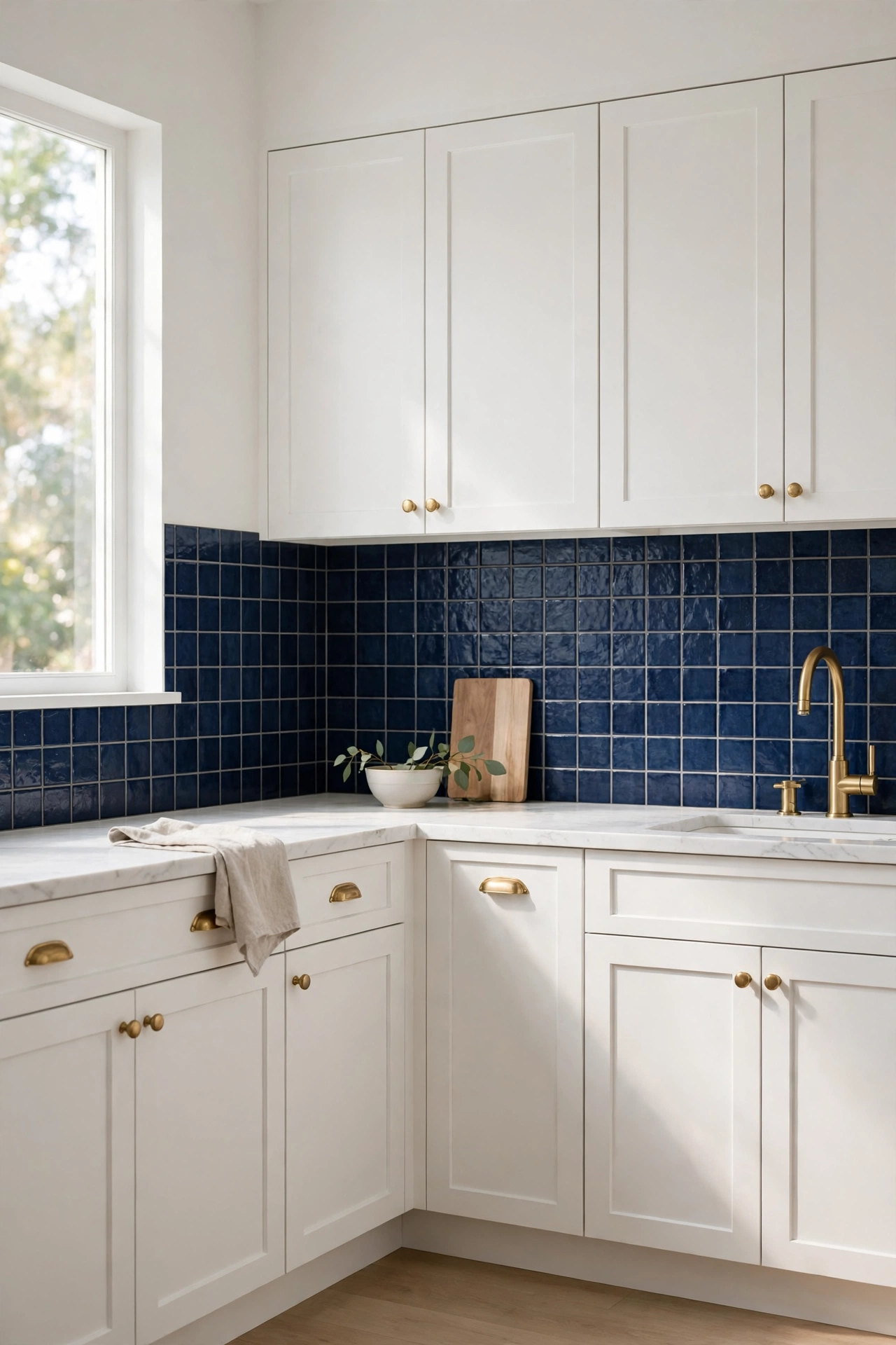
20. Make One Bold Move With a Navy Statement Wall
A navy backsplash is the boldest idea in this guide, and the one with the biggest payoff. A deep, inky blue wall behind a white kitchen reads as confident and classic at the same time — it is the color of a tailored jacket, and it makes brass hardware glow and white cabinets look crisper. Keep the navy to one wall, usually the range wall, and keep everything else in the kitchen quiet: white uppers, pale counters, simple hardware. A glossy navy tile reflects light and keeps the dark wall from feeling heavy, while a matte navy feels softer and more modern.
Because navy is dark, installation precision matters: a crooked edge or a gap shows clearly against a light counter. Use a level for every row and finish the top edge with a thin brass trim strip, which picks up the warmth of the hardware and makes the edge look deliberate. Under-cabinet lighting is essential with a dark wall — warm light grazing the surface shows off the glaze and keeps the kitchen bright. If you have always wanted a dark kitchen but were afraid to commit, a peel and stick navy wall lets you try it for the price of a dinner out, and peel it off if you change your mind.
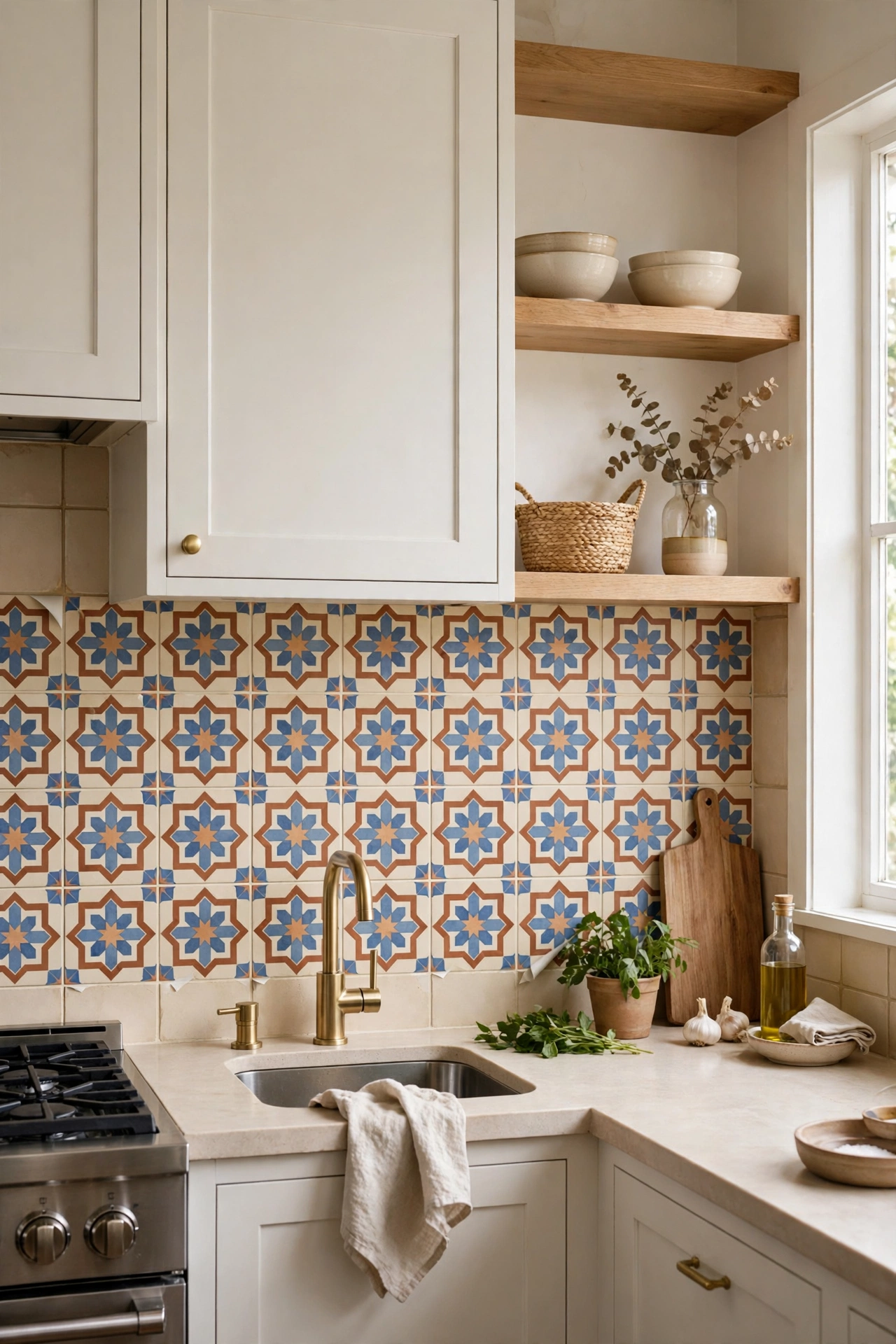
21. Cover Dated Tile With Tile Stickers
Stuck with small beige squares from decades ago? Tile stickers go right over the old tile, so nothing comes off the wall. This is the cheapest and least disruptive idea in this guide: clean the old tiles, stick the new ones on top, and the kitchen changes in an afternoon without a hammer or a skip. The stickers come in every pattern in this guide — subway, Moroccan, geometric — so you are not limited to a plain cover-up. Choose a sticker slightly larger than the old tile if you want to hide the grout lines, or the same size if you want to keep the old grid and just change the color and pattern.
The one rule is surface prep: the old tile must be clean, dry, and free of grease, or the stickers will lift at the edges within weeks. Wash with a degreaser, rinse, and let the wall dry fully before you start. Press each sticker firmly, especially at the corners, and run a plastic card over the surface to push out air. If a sticker ever lifts, a dab of extra adhesive or a replacement sticker fixes it in minutes. For renters, this is the ultimate trick: the old tile stays underneath, untouched, and the new look peels off when you move out.
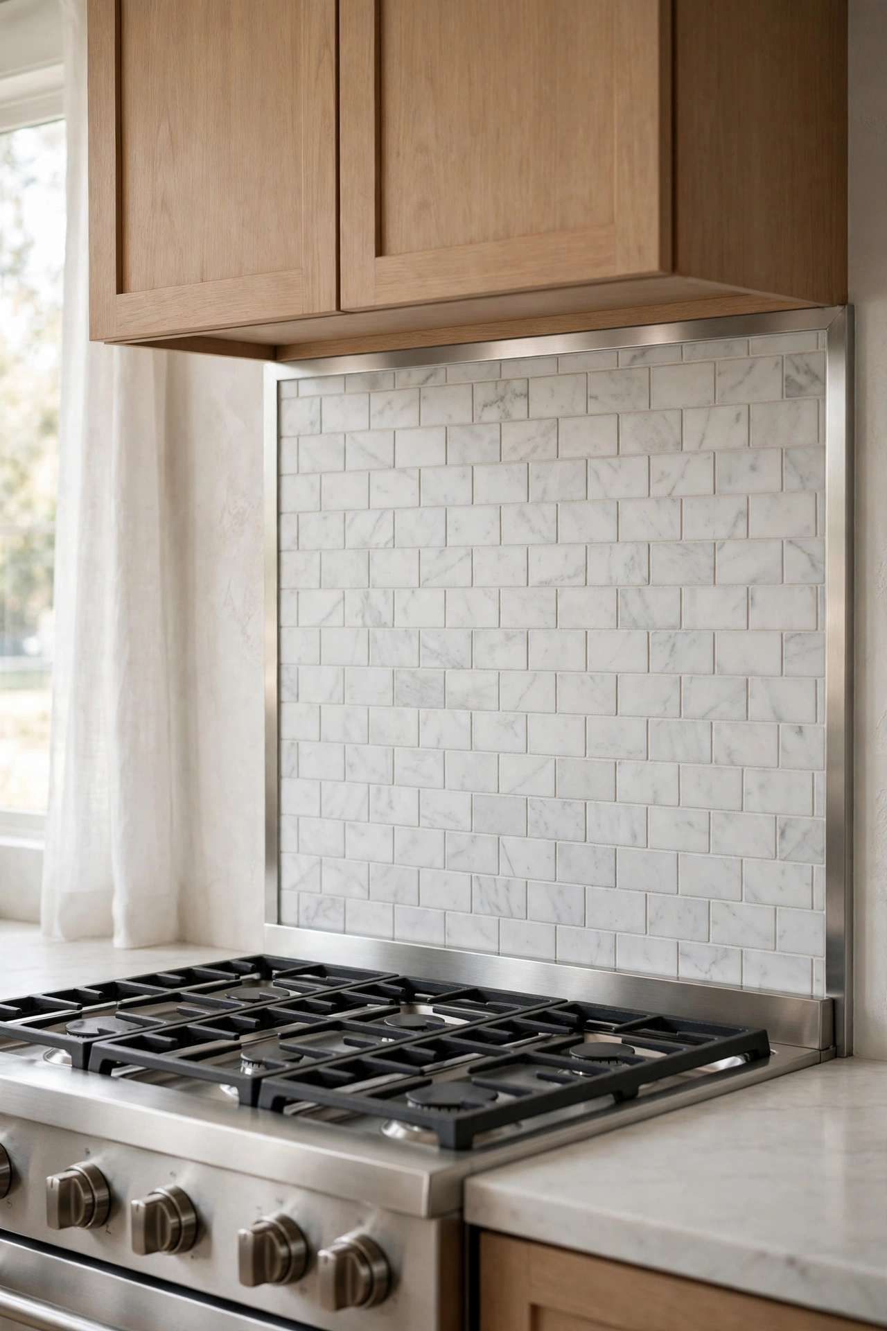
22. Handle the Stove Wall the Smart Way
The wall behind the stove is the trickiest zone for any peel and stick backsplash, because heat softens adhesive. The smart approach is not to avoid the stove wall — it is the wall that needs a backsplash most — but to install it with a heat-safe plan. Leave a small gap behind a gas range, or use a metal or glass-look peel and stick product rated for higher temperatures in that zone, and keep the vinyl-only products on the cooler walls. A thin stainless steel or tempered glass panel behind the burners, flanked by peel and stick tile on either side, gives you the look of a full backsplash with none of the risk.
Check the product’s temperature rating before you buy, and when in doubt, ask the manufacturer — a quick message saves a melted tile. Electric ranges are more forgiving than gas, because the heat rises straight up rather than licking the wall. Whatever you install, seal the bottom edge where the tile meets the counter with a thin bead of heat-resistant silicone, so grease and steam cannot creep behind it. Done right, the stove wall is not a problem to work around — it is the best-looking wall in the kitchen.
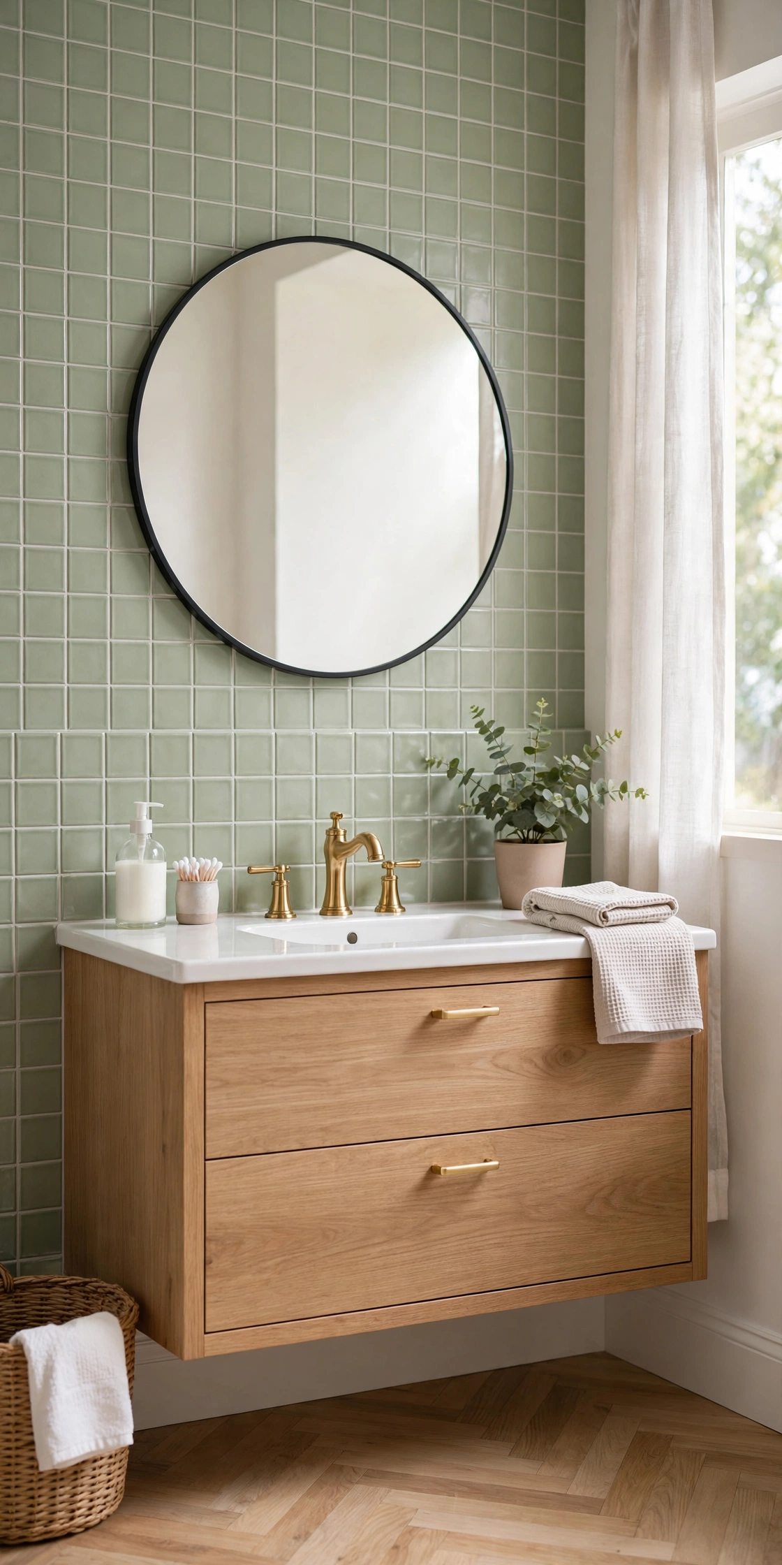
23. Take Peel and Stick Beyond the Kitchen
A peel and stick backsplash does not have to live in the kitchen. A bathroom vanity backsplash in a soft green or a marble-look panel turns a plain sink wall into a finished vanity in under an hour, and the smaller area means a single box of tiles is often enough. A laundry room is another perfect spot: the wall behind the washer and dryer takes constant splashes, and a wipeable peel and stick surface protects it while making the room look intentional. Even a bar cart wall, a coffee station, or the back of a desk nook benefits from a small strip of tile that defines the zone.
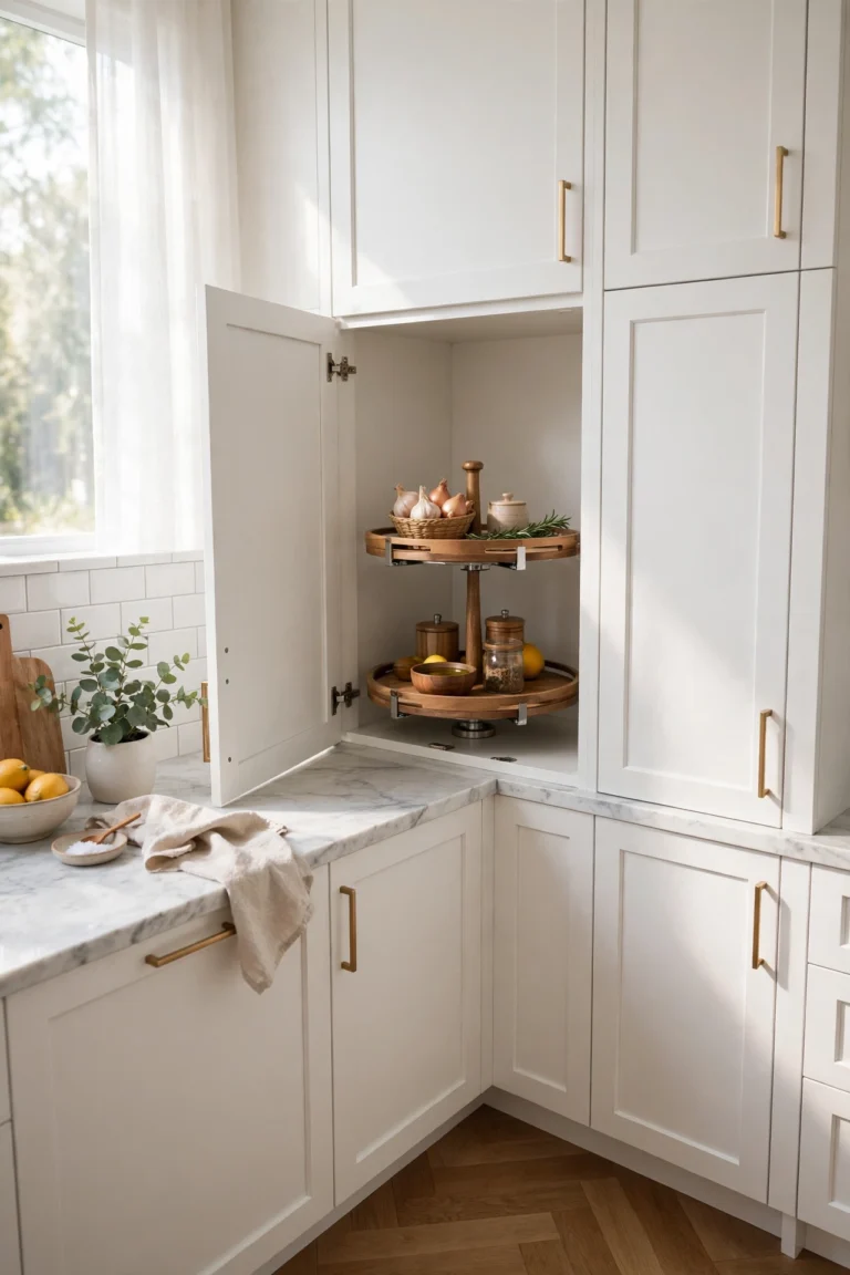
The same rules apply in every room: a smooth, clean wall, a level first row, and a sealed bottom edge where water might reach. In a bathroom, choose a product rated for moisture and seal the edges with silicone, because steam is harder on adhesive than a kitchen splash. The joy of these small projects is how little they cost and how much they change a room — a bathroom that felt unfinished suddenly feels designed. Our kitchen corner cabinet ideas and genius IKEA hacks are full of the same kind of small, high-impact upgrades for the rest of the house.
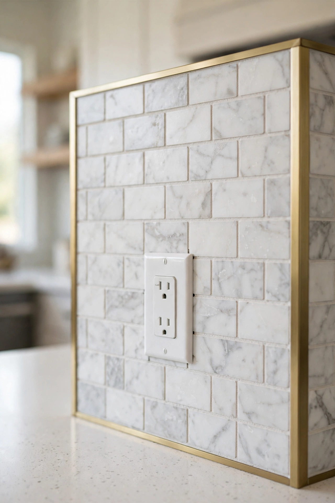
24. Finish the Edges Like a Professional
The difference between a peel and stick backsplash that looks custom and one that looks stuck-on is almost entirely in the edges. Three finishing moves do most of the work. First, end the tile at a deliberate stopping point — a cabinet line, a corner, or the edge of a window trim — instead of stopping randomly mid-wall. Second, finish every exposed edge with a thin trim strip in metal, or a matching edge tile, so the raw edge of the vinyl never shows. Third, cut around outlets with care: remove the outlet cover, tile up to the box, and replace the cover so it sits flush over the tile, hiding the cut completely.
These details take an extra half hour and cost almost nothing, but they are what make guests assume the backsplash is real tile. The same discipline applies to the top edge: a straight, level top line with a trim strip reads as built-in, while a wavy edge reads as a sticker. Use a sharp blade for every cut — a dull blade tears vinyl and leaves a ragged edge that no trim can hide. If you remember only one idea from this guide, remember this one: the edges are the whole job.
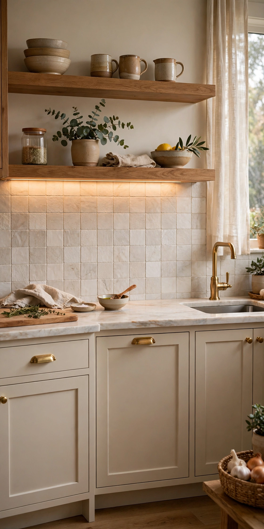
25. Style the Wall So It Reads Built-In
The final idea is not about the tile at all — it is about everything around it. A peel and stick backsplash reads as built-in when the wall is styled like a finished kitchen: a wood shelf with a few dishes above it, under-cabinet lighting that warms the tile in the evening, hardware that matches the trim, and a counter kept clear enough for the wall to breathe. One real, tactile element nearby — a linen cafe curtain, a vintage wood cutting board, a ceramic vase — stops the wall from having to do all the work, and makes the whole kitchen feel layered rather than flat. This is the step most people skip, and the one that makes the biggest difference in photographs.
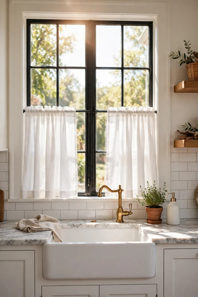
Keep the styling simple: three or four objects on the shelf, one plant, and a clear counter. A cluttered counter makes even real tile look messy, while a calm counter makes peel and stick look expensive. If the kitchen has a window over the sink, our kitchen window curtains over the sink ideas show how a simple curtain frames the wall beautifully. And if the ceiling above the kitchen could use the same no-renovation treatment, our popcorn ceiling ideas include peel-and-stick planks that work the same way overhead. Style the wall, light it well, and nobody will ask whether it is real — they will ask where you got it.
Frequently Asked Questions
Do peel and stick backsplashes really stay up?
Yes, when the wall is properly prepared. Peel and stick backsplashes stay up for years on smooth, clean, fully cured paint — the adhesive needs a flat surface to grip, and it needs the paint underneath to be fully cured, which usually takes two to four weeks after painting. Wash the wall with a degreaser, let it dry completely, and press each tile firmly with a roller or a plastic card to remove air. They fail most often on heavy orange-peel texture, raw plaster, brick, or dusty and chalky surfaces, where the adhesive cannot make full contact.
Can you put a peel and stick backsplash behind a stove?
You can, with care. Behind an electric stove, most peel and stick products are fine, because the heat rises straight up. Behind a gas stove, use a metal or glass-look product rated for higher temperatures, or leave a small gap and fit a stainless steel or tempered glass panel behind the burners. Always check the product’s temperature rating before you buy, and seal the bottom edge with heat-resistant silicone so grease and steam cannot get behind the tiles.
How do you remove a peel and stick backsplash without damaging the wall?
Warm a corner with a hairdryer on a low setting — the heat softens the adhesive — then pull slowly at a low angle, like unrolling a sticker, rather than yanking straight out. Work in small sections, warming as you go, and the tiles usually come off cleanly. Any leftover adhesive residue wipes away with warm soapy water or a gentle adhesive remover. Never use a metal scraper on the wall, and never pull fast, because speed is what tears paint.
Can peel and stick backsplash go over old tile?
Yes, and it is one of the best uses for it. Tile stickers and thin peel and stick tiles go directly over old tile, hiding dated colors and patterns without any demolition. The old tile must be clean, dry, and grease-free, and the grout lines should be reasonably flat — very deep grout lines can show through thin stickers, so choose a thicker tile or a larger sticker if the old grout is deep. The old tile stays intact underneath, which makes this the ideal renter-friendly upgrade.
How long does a peel and stick backsplash last?
On a properly prepared wall in a normal kitchen, a good-quality peel and stick backsplash lasts several years — many people get three to five years from a single install, and some longer. Thicker PVC and metal tiles last longer than thin vinyl sheets, and a backsplash that is kept dry at the edges and cleaned gently lasts longer than one that is scrubbed hard or soaked. Because the product is inexpensive and removable, replacing a tired section is a small job rather than a renovation.
What surfaces will peel and stick backsplash not stick to?
Peel and stick adhesive struggles on heavy orange-peel or knockdown texture, raw plaster, brick, stone, and any dusty, chalky, or greasy surface, because the adhesive cannot make full contact. It also does not bond well to fresh paint that has not fully cured, or to wallpaper that is already peeling. If your wall is heavily textured, skim it smooth first, or choose a thicker panel product that bridges small imperfections. A quick test helps: stick one tile, leave it for a day, and check the edges before committing to the whole wall.
Conclusion
A peel and stick backsplash is the rare home project that is cheap, fast, reversible, and genuinely good-looking — if you choose the right product and finish the edges like a professional. Start with a look that suits your kitchen, whether that is classic glossy subway, a seamless faux marble slab, a bold geometric, or a soft sage stack. Prep the wall properly, keep the first row level, trim the edges, and style the wall with light and a few real, tactile objects. You do not need all 25 ideas to change your kitchen — pick the one that fits your cabinets, your budget, and your confidence today, and the wall will already feel new. And when you are ready for more, our farmhouse kitchen backsplash ideas show the permanent versions of these looks, for the day you decide to make one of them forever.